- Made by AppCoda
- Contact us / Support
- Tweet this book
- 序言
- 1. SwiftUI 介绍
- 2. SwiftUI 入门 - 文字的处理
- 3. 图片的处理
- 4. 以堆叠布局使用者介面
- 5. ScrollView 与 Carousel UI 的建立
- 6. SwiftUI 按钮与渐层
- 7. 状态(State)与绑定(Binding)
- 8. 实现路径(Path)与形状(Shape)来画线与圆饼图
- 9. 基础动画与转场
- 10. 动态列表、 ForEach 与 Identifiable 的使用方法
- 11. 导航UI与导航列客制化运用
- 12. 强制回应视图、浮动按钮与提示的实现
- 13. 以选取器(Picker)、开关(Toggle)与步进器(Stepper)来建立一个表单
- 14. 使用 Combine 与 Environment 物件进行数据分享
- 15. 以 Combine 与 视图模型建立一个注册表单
- 16. 滑动删除、内容菜单与动作列表
- 17. 认识手势(Gestures)
- 18. 以SwiftUI 手势与 GeometryReader 建立一个底部展开式页面
- 19. 使用手势与动画建立 Tinder 风格的 UI
- 20. 建立像 Apple Wallet App 的动画和转场效果
- 21. JSON、滑杆的运用与数据过滤
- 22. 如何使用 Core Data 建立 ToDo App
- 23. 利用 UIViewRepresentable 整合UIKit 组件
- 24. 建立搜寻栏视图并使用自订绑定(Custom Binding)
- 25. 把所学应用出来!构建个人理财App
- 26. 创建类似App Store使用的动画视图转换
- 27. 如何建立图像轮播(Image Carousel)
- 28. 如何建立展开式列表视图和大纲视图
- 29. 使用 LazyVGrid 和 LazyHGrid 构建集合视图
- 30. 使用 Shape 和 Animatable 开发带动画的环形进度条
- 31. 如何使用 AnimatableModifier 和 LibraryContentProvider
- 32. 使用 TextEditor 支持多行文字输入
- 33. 使用 matchedGeometryEffect为 App 建立绚丽的视图动画
- 34. ScrollViewReader 和网格动画
- 35. 标签视图的运用与自订标签列
- 36. 利用 AsyncImage 非同步加载和显示图像
- 37. 利用 Searchable 建立搜寻栏
- 38. 利用 Charts 框架建立图表
- 39. 利用 Live Text API 从图片中撷取文本
- 40. 通过 ShareLink 来分享文本和图像等数据
- 41. 利用 ImageRenderer API 轻松把 SwiftUI 视图转换为图像
- 42. 如何把 SwiftUI 视图转换为 PDF 文件
- 43. 使用 Gauge 视图显示进度并创建速度计
- 44. 使用Grid API 创建网格布局
- 45. 利用 AnyLayout 切换 UI 布局
- 46. 使用新的 NavigationStack 视图构建数据导向的导航
- 本书使用 GitBook 释出
第 26 章
创建类似App Store使用的动画视图转换
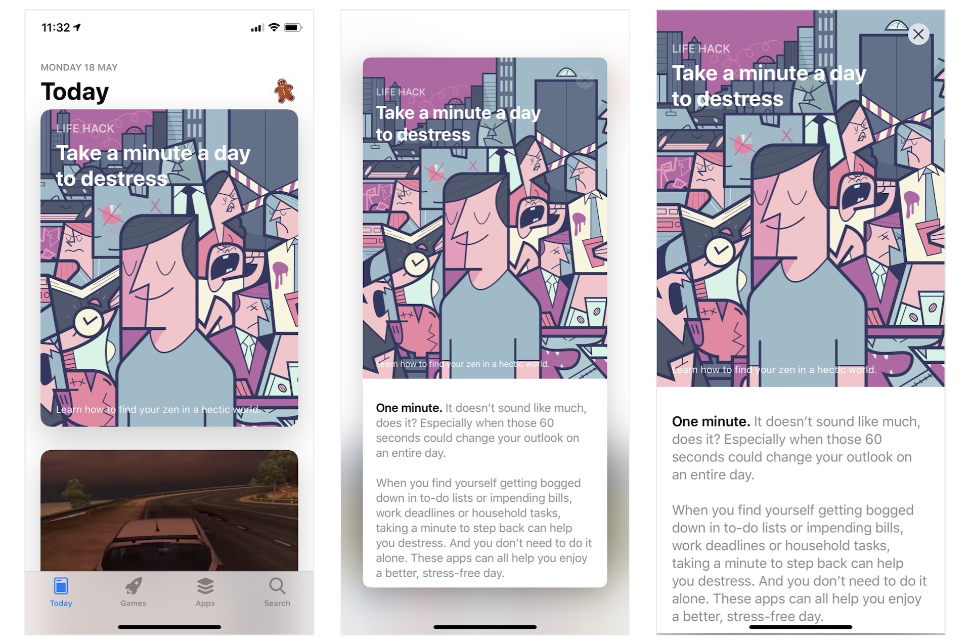
相信你一定使用过 iPhone 内置的 App Store App。 在 Today 部分,它提供一系列的文章和App推荐。 而作为App开发者,最令我感兴趣的是它使用的动画视图转换效果。 正如图 26.1 显示,文章以卡片形式列出。 当你点击它时,卡片会弹出以显示全部内容。要关闭文章视图并返回列表视图,你只需点击关闭按钮 。 如果你不明白我的意思,我提议你立刻在 iPhone 上打开 App Store 试一试。
在本章中,我们将构建一个类似的列表视图并使用 SwiftUI 实现动画过渡。 通过建立示例App,你将学习以下技术:
- 如何使用 GeometryReader 检测屏幕尺寸
- 如何创建可变大变小的卡片视图(Card View)
- 如何实现类似 App Store 内的视图转换动画效果
酷!让我们开始吧。
示例 App 简介
像往常一样,我们将一起构建一个示例 App。 App看起来与 App Store App 非常相似,只是没有标签列(Tab Bar)。 打开App 后会见到一个列表视图,以卡片格式显示所有文章。 当使用者点击任何文章时,卡片会扩展为全屏幕并显示整篇文章。 要返回列表视图,使用者可以点击关闭按钮或向下拖动文章视图。
我们将由零开始建立App, 但是为了节省你一些时间,我已准备了一个Starter项目。 你可以从 https://www.appcoda.com/resources/swiftui4/SwiftUIAppStoreStarter.zip 下载它。 下载项目后,解压后并打开SwiftUIAppStore.xcodeproj查看一下。
这个Starter项目已经为了实现以下项目:
- 它已经将所需的图像加进 Assets。
ContentView.swift是 Xcode 自动生成的SwiftUI 视图。Article.swift包含Article结构,用于代表App内的文章。 因为是示例关系,Starter项目还包含一些测试数据(sampleArticles数组)。 如果你想加入更多文章,你可以随便修改sampleArticles。
了解卡片视图
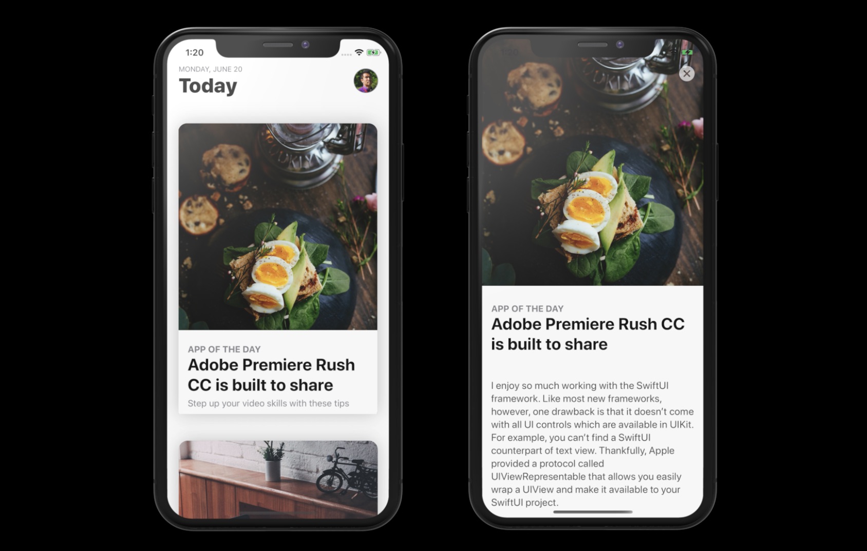
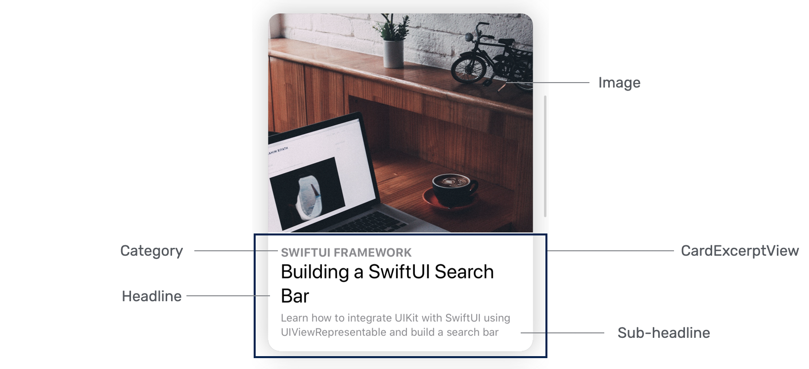
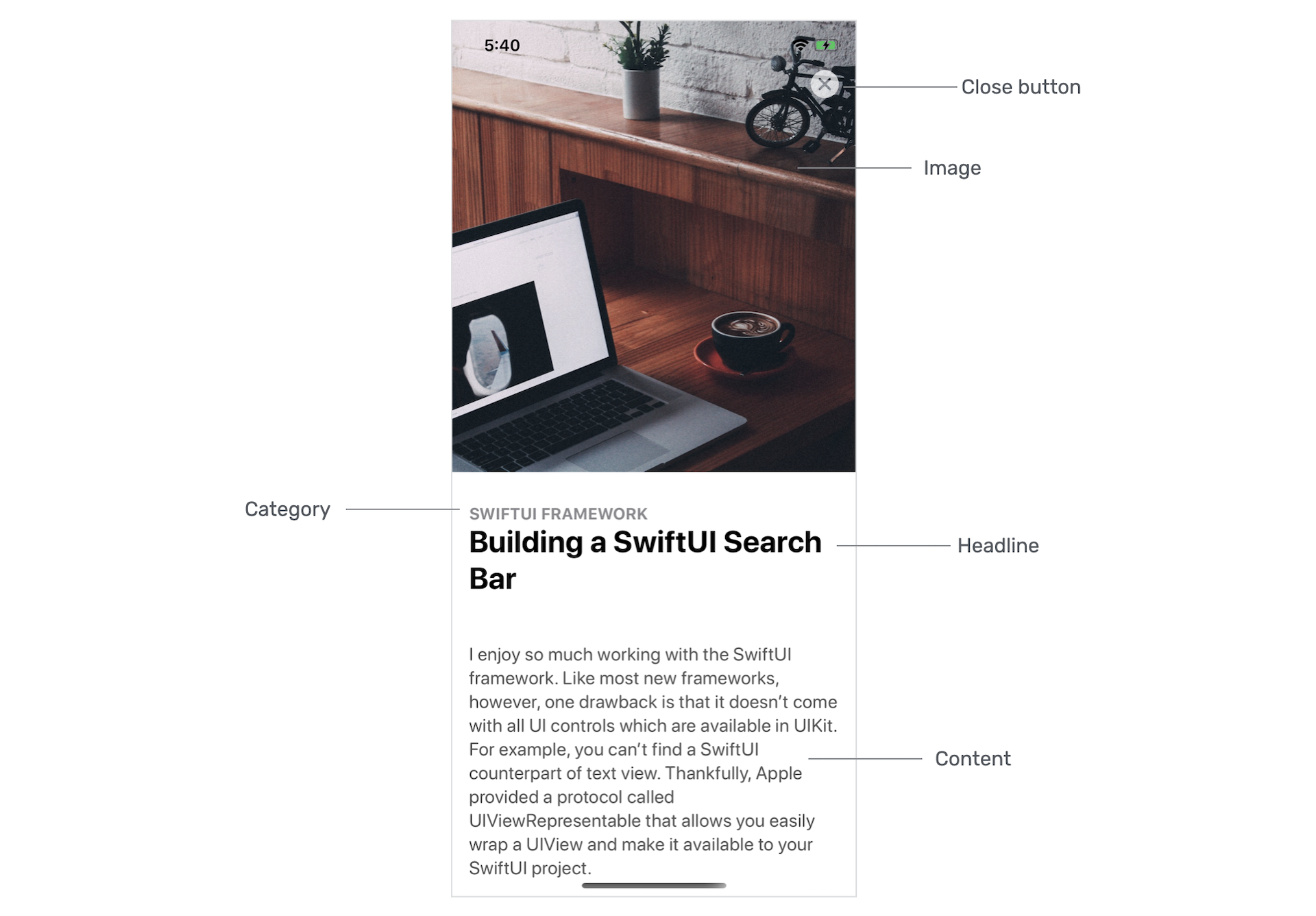
你之前已经学习过如何创建类似卡片式UI。 这个卡片视图与第 5 章中做的非常相似,但它会更加灵活并且支持滚动内容。 换句话说,它有两种模式:节录和完整内容。 在节录模式下,只显示文章的图片、类别、标题和副标题。 完整内容模式则显示文章详细内容,如图26.2所示。
如果你仔细观察图 26.4 所示的卡片视图,你会发现卡片视图的大小会根据图像的高度而变化。 但是,卡片的高度不会超过 500 点。
让我们也看看卡片视图在完整内容模式下的外观。 如下图所示,卡片视图展开以全屏幕显示内容。 除此之外,图像变大了,副标题则被隐藏。 此外,关闭按钮会出现在屏幕上,让使用者关闭视图。 还有,这是一个可滚动的视图。
实现卡片视图
现在你了解了此卡片视图的要求,让我们看看如何建立它。 我们将使用一个新文档来建立卡片视图。 在项目导航器中,右点 View 文件夹并选择 New file...。 选择 SwiftUI View 模板并将文件命名为 ArticleCardView.swift。
首先,让我们从节录视图开始,它是覆盖在图像顶部的视图(图 26.5)。 将代码修改如下:
struct ArticleExcerptView: View {

    let category: String
    let headline: String
    let subHeadline: String

    @Binding var isShowContent: Bool

    var body: some View {
        VStack(alignment: .leading) {
            Spacer()

            Rectangle()
                .frame(minHeight: 100, maxHeight: 150)
                .overlay(
                    HStack {
                        VStack(alignment: .leading) {
                            Text(self.category.uppercased())
                                .font(.subheadline)
                                .fontWeight(.bold)
                                .foregroundColor(.secondary)

                            Text(self.headline)
                                .font(.title)
                                .fontWeight(.bold)
                                .foregroundColor(.primary)
                                .minimumScaleFactor(0.1)
                                .lineLimit(2)
                                .padding(.bottom, 5)

                            if !self.isShowContent {
                                Text(self.subHeadline)
                                    .font(.subheadline)
                                    .foregroundColor(.secondary)
                                    .minimumScaleFactor(0.1)
                                    .lineLimit(3)

                            }
                        }
                        .padding()

                        Spacer()
                    }
            )
        }
        .foregroundColor(.white)

    }
}
ArticleExcerptView 能灵活地显示不同的内容。 因此,我们定义了上面的变量。 如前所述,卡片视图应该能够在 excerpt 和 full content 模式之间切换。 那个绑定变量(即isShowContent)就是用于控制内容的模式。 当它的值设定为 false 时,它处于节录模式。 相反,当它为 true 时,它处于完整内容模式。 副标题要在 isShowContent 设定为 true 时才会出现。
其实有多种方法来布局节录视图。 在上面的代码,我们创建一个 Rectangle 视图并用标题和子标题覆盖它。 你应该非常熟悉那些附加到Text视图的修饰器, 但是 minimumScaleFactor 修饰器值得一提。 通过此修饰器,系统会跟据可用空间的大小自动将字体缩小。 例如,如果标题包含太多文字,iOS 会将它缩小 10%。
预览使用者界面
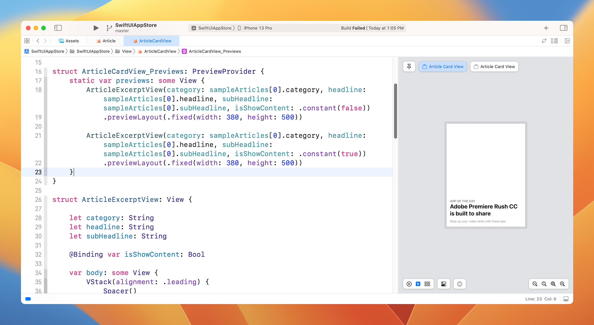
要预览节录视图,你可以像这样修改预览代码:
struct ArticleCardView_Previews: PreviewProvider {
    static var previews: some View {
        ArticleExcerptView(category: sampleArticles[0].category, headline: sampleArticles[0].headline, subHeadline: sampleArticles[0].subHeadline, isShowContent: .constant(false)).previewLayout(.fixed(width: 380, height: 500))

        ArticleExcerptView(category: sampleArticles[0].category, headline: sampleArticles[0].headline, subHeadline: sampleArticles[0].subHeadline, isShowContent: .constant(true)).previewLayout(.fixed(width: 380, height: 500))
    }
}
因为想预览两种模式,我们建立两个节录视图。一个将isShowContent绑定设定为false,另一个则为true。 sampleArticles 数组是Starter项目附带的测试数据。
我们不使用装置预览,而是在固定大小的矩形中预览 UI。 如果一切正常,你应该会在预览画面中看到节录视图。请确保你修改为 Selectable 模式以预览固定布局。
准备好节录视图后,让我们实现文章卡片视图。 像这样修改 ArticleCardView 结构:
struct ArticleCardView: View {

    let category: String
    let headline: String
    let subHeadline: String
    let image: UIImage
    var content: String = ""

    @Binding var isShowContent: Bool

    var body: some View {
        ScrollView {
            VStack(alignment: .leading) {
                Image(uiImage: self.image)
                    .resizable()
                    .scaledToFill()
                    .frame(height: min(self.image.size.height/3, 500))
                    .border(Color(.sRGB, red: 150/255, green: 150/255, blue: 150/255, opacity: 0.1), width: self.isShowContent ? 0 : 1)
                    .cornerRadius(15)
                    .overlay(
                        ArticleExcerptView(category: self.category, headline: self.headline, subHeadline: self.subHeadline, isShowContent: self.$isShowContent)
                            .cornerRadius(self.isShowContent ? 0 : 15)
                    )

                // Content
                if self.isShowContent {
                    Text(self.content)
                        .foregroundColor(Color(.darkGray))
                        .font(.system(.body, design: .rounded))
                        .padding(.horizontal)
                        .padding(.bottom, 50)
                        .transition(.move(edge: .bottom))
                }
            }
        }
        .shadow(color: Color(.sRGB, red: 64/255, green: 64/255, blue: 64/255, opacity: 0.3), radius: self.isShowContent ? 0 : 15)
    }
}
为了做出卡片视图的布局,我们将 ArticleExcerptView 覆盖在 Image 视图之上。 图像视图设定为 .scaledToFill,高度不可超过 500 点。 而且是当 isShowContent 绑定设定为 true 时,才会显示 content。
为了使视图可滚动,我们将 VStack 嵌入到ScrollView视图中。 shadow 修饰器用于为卡片视图添加阴影。
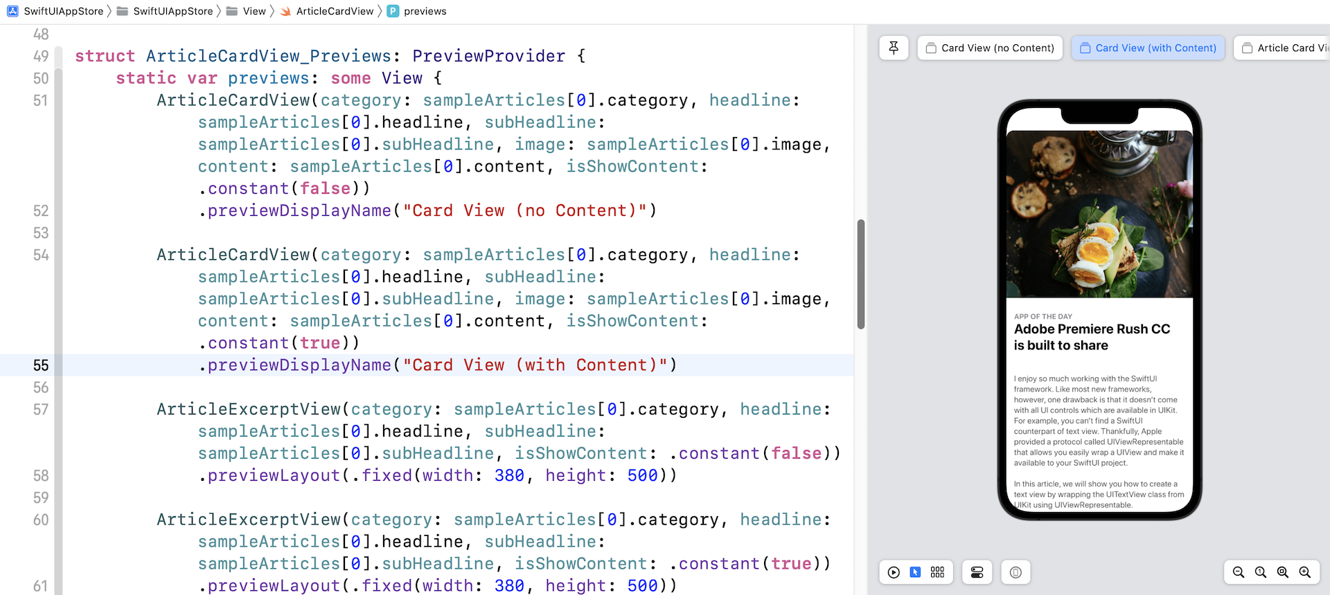
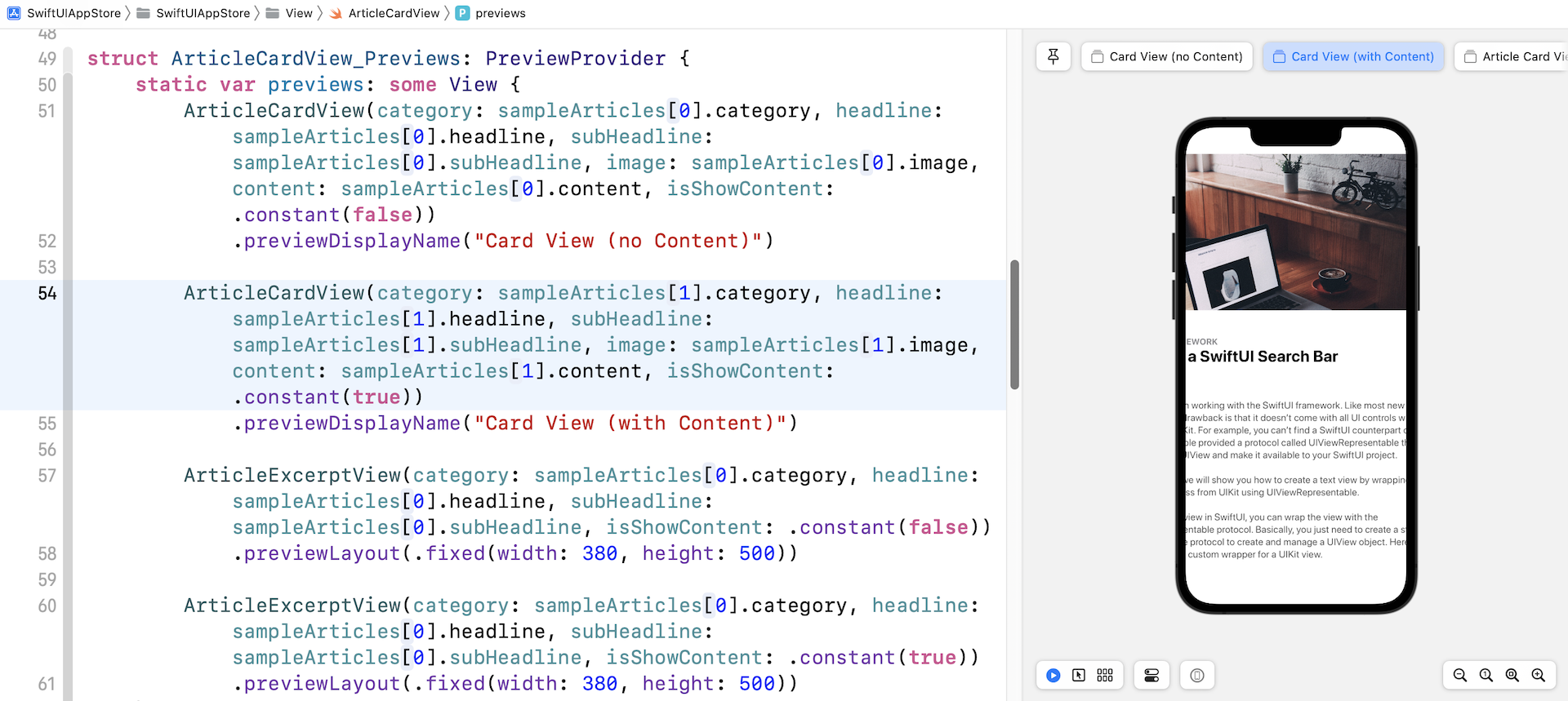
要预览文章卡片视图,你可以在 ArticleCardView_Previews 中加入以下代码:
ArticleCardView(category: sampleArticles[0].category, headline: sampleArticles[0].headline, subHeadline: sampleArticles[0].subHeadline, image: sampleArticles[0].image, content: sampleArticles[0].content, isShowContent: .constant(false))
    .previewDisplayName("Card View (no Content)")

ArticleCardView(category: sampleArticles[0].category, headline: sampleArticles[0].headline, subHeadline: sampleArticles[0].subHeadline, image: sampleArticles[0].image, content: sampleArticles[0].content, isShowContent: .constant(true))
    .previewDisplayName("Card View (with Content)")
进行修改后,你应该能够在预览画面中看到卡片 UI。 此外,你应该看到两个模拟器,一个显示节录视图,另一个显示完整内容。
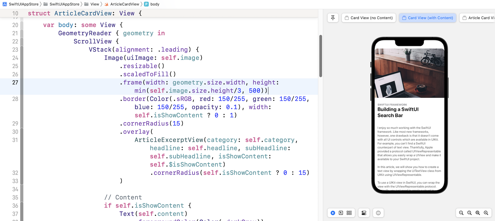
使用 GeometryReader
似乎一切都很好。 但是,如果你尝试使用另一篇示例文章(例如,sampleArticles[1])预览卡片视图,则 UI 看起来不太好。 图像和内容都超出了屏幕边缘。
让我们再看看之前的代码。 对于 Image 视图,我们只限制了图像的高度,对它的宽度没有任何限制:
.frame(height: min(self.image.size.height/3, 500))
为了解决这个问题,我们必须限制frame的宽度并确保它不超过屏幕的宽度。 问题是如何找出屏幕的宽度? SwiftUI 提供了一个名为GeometryReader的容器视图,可以读取parent view的大小。 因此,我们需要将 ScrollView 嵌入到 GeometryReader 中,如下所示:
var body: some View {
    GeometryReader { geometry in
        ScrollView {
            VStack(alignment: .leading) {
                .
                .
                .
            }
        }
        .shadow(color: Color(.sRGB, red: 64/255, green: 64/255, blue: 64/255, opacity: 0.3), radius: self.isShowContent ? 0 : 15)
    }
}
在 GeometryReader 的闭包中,它有一个参数,可以为你提供有关视图的额外数据,例如大小和位置。 要将框架的宽度限制为屏幕大小的话,我郐就可以像这样修改 .frame 修饰器:
.frame(width: geometry.size.width, height: min(self.image.size.height/3, 500))
在代码中,我们将宽度设定为屏幕宽度。 完成修改后,就可以解决之前遇到的问题。
添加关闭按钮
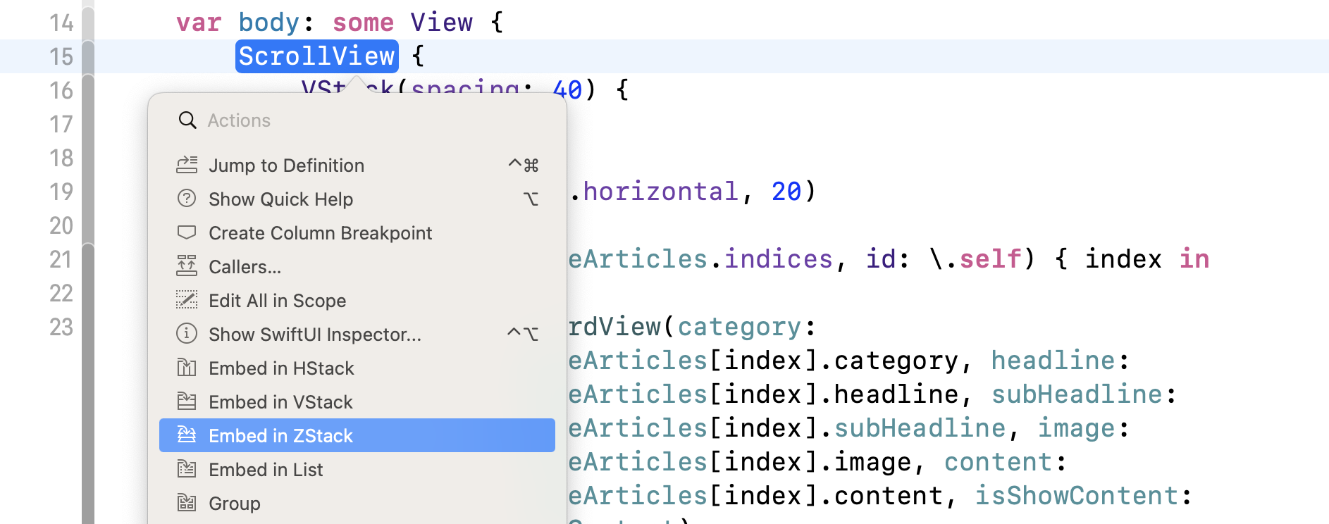
卡片视图几乎完成了,但还剩下一件事。 我们还没有加入关闭按钮。 为了将按钮覆盖在图像顶部,我们要将滚动视图嵌入到ZStack中。 你可以直接修改代码以添加ZStack,但这里让我试范另一种方法。
按住 command 键并单击ScrollView,你应该会看到一个菜单。 选择 Embed in ZStack 将滚动视图嵌入到 ZStack 中。
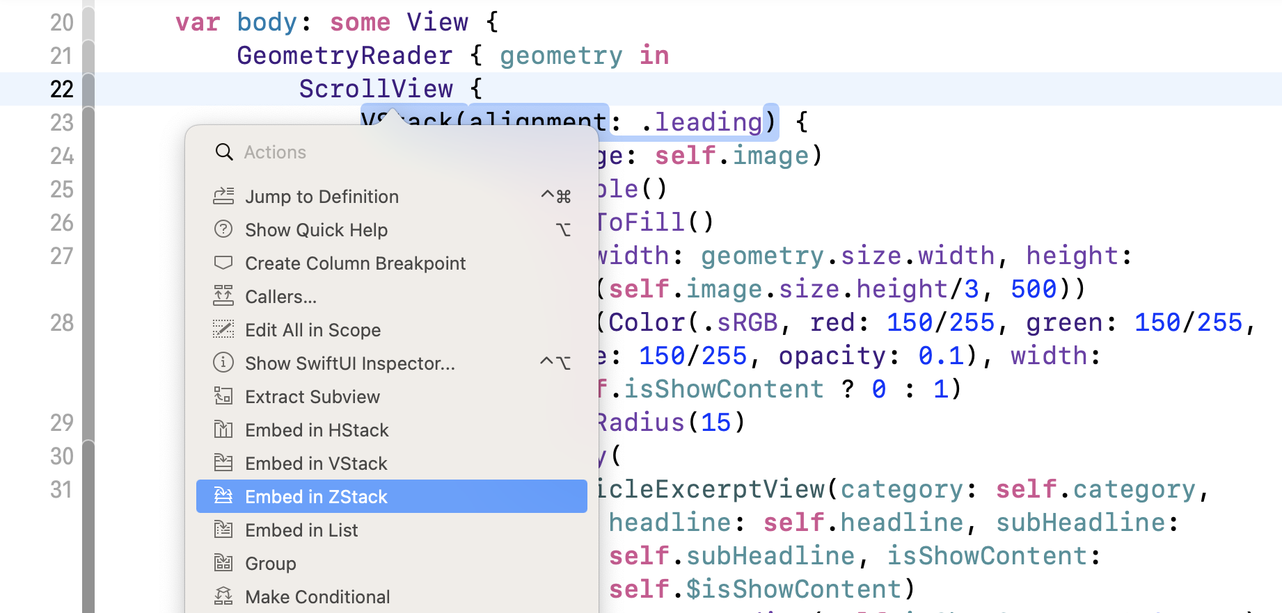
Xcode 会自动将代码缩排并将滚动视图嵌入到 ZStack 中。 现在修改 ZStack ,将 alignment 设定为 .topTrailing。这样就可以将关闭按钮放置在右上角的地方。 你的代码应如下所示:
var body: some View {
    GeometryReader { geometry in
        ZStack(alignment: .topTrailing) {
            ScrollView {
                VStack(alignment: .leading) {
                    .
                    .
                    .
                }
            }
            .shadow(color: Color(.sRGB, red: 64/255, green: 64/255, blue: 64/255, opacity: 0.3), radius: self.isShowContent ? 0 : 15)
        }
    }
}
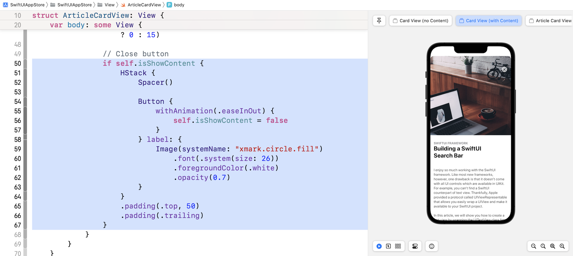
接下来,在 .shadow 修饰器正下方加入以下代码以添加关闭按钮:
if self.isShowContent {
    HStack {
        Spacer()

        Button {
              withAnimation(.easeInOut) {
                self.isShowContent = false
            }
        } label: {
            Image(systemName: "xmark.circle.fill")
                .font(.system(size: 26))
                .foregroundColor(.white)
                .opacity(0.7)
        }
    }
    .padding(.top, 50)
    .padding(.trailing)
}
修改后,当 isShowContent 的值设定为 true 时,预览就会显示关闭按钮。
构建列表视图
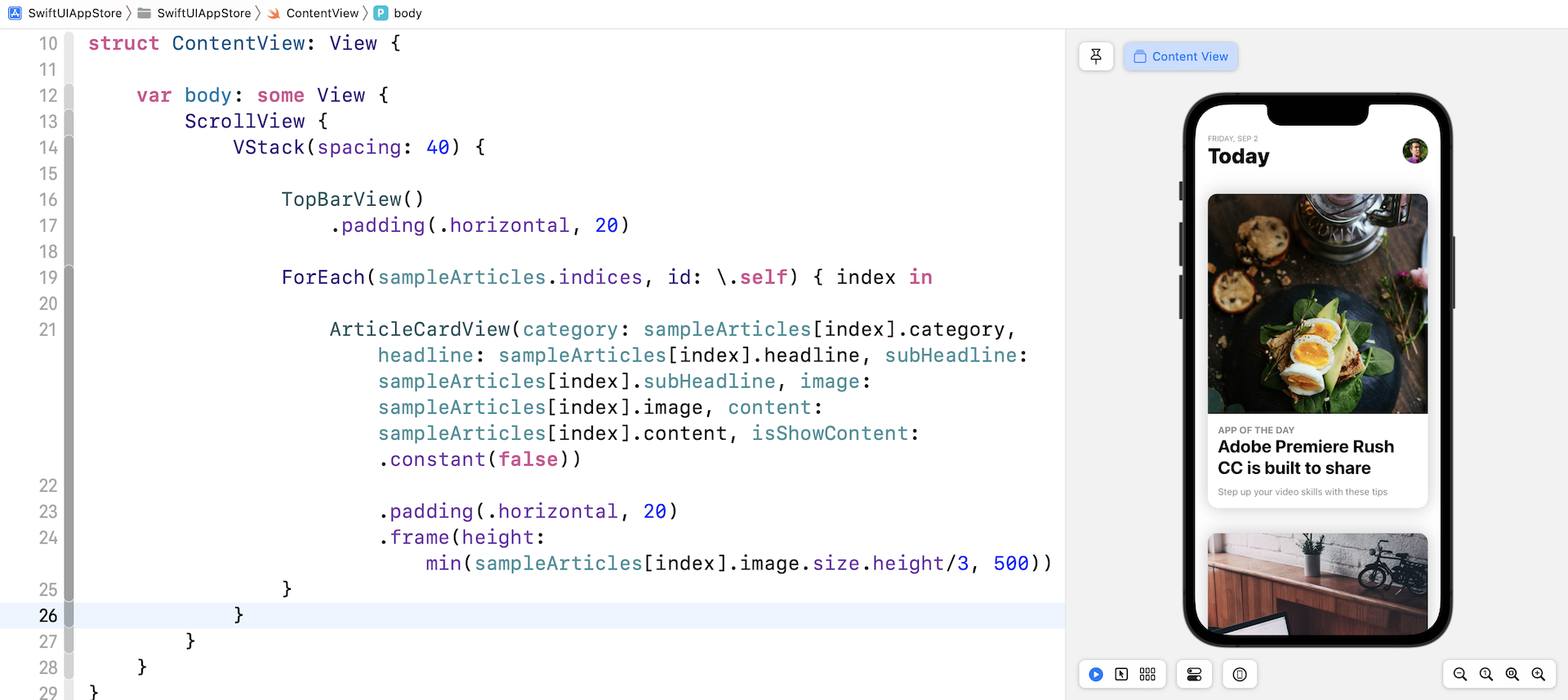
现在我们已经实现了卡片视图的布局,让我们切换到 ContentView.swift 并创建列表视图。 在列表视图的最顶部,是带有标题和个人数据照片的顶部栏(Top Bar)。

我相信你应该知道如何使用 VStack 和 HStack 来布局。 为了将代码整理得更好,我将在两个独立的结构中创建顶部栏和头像。 在 ContentView.swift 中插入以下代码:
struct TopBarView : View {

    var body: some View {
        HStack(alignment: .lastTextBaseline) {
            VStack(alignment: .leading) {
                Text(getCurrentDate().uppercased())
                    .font(.caption)
                    .foregroundColor(.secondary)
                Text("Today")
                    .font(.largeTitle)
                    .fontWeight(.heavy)
            }

            Spacer()

            AvatarView(image: "profile", width: 40, height: 40)

        }
    }

    func getCurrentDate(with format: String = "EEEE, MMM d") -> String {
        let dateFormatter = DateFormatter()
        dateFormatter.dateFormat = format
        return dateFormatter.string(from: Date())
    }
}

struct AvatarView: View {
    let image: String
    let width: CGFloat
    let height: CGFloat

    var body: some View {
        Image(image)
            .resizable()
            .frame(width: width, height: height)
            .clipShape(Circle())
            .overlay(Circle().stroke(Color.gray, lineWidth: 1))
    }
}
接下来,像这样修改 ContentView 的代码:
struct ContentView: View {

    var body: some View {
        ScrollView {
            VStack(spacing: 40) {

                TopBarView()
                    .padding(.horizontal, 20)

                ForEach(sampleArticles.indices, id: \.self) { index in

                    ArticleCardView(category: sampleArticles[index].category, headline: sampleArticles[index].headline, subHeadline: sampleArticles[index].subHeadline, image: sampleArticles[index].image, content: sampleArticles[index].content, isShowContent: .constant(false))

                        .padding(.horizontal, 20)
                        .frame(height: min(sampleArticles[index].image.size.height/3, 500))
                }
            }
        }
    }
}
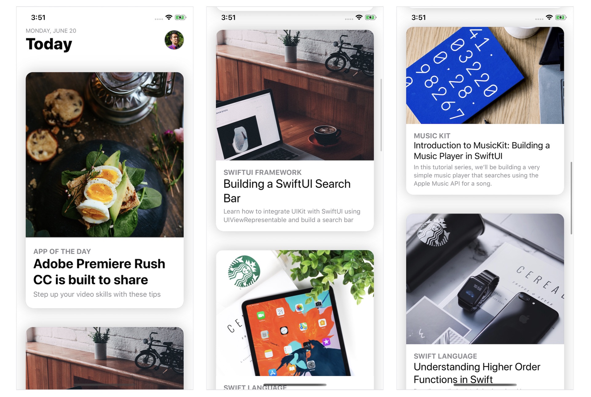
我们在 ScrollView 中嵌入了一个 VStack 来创建垂直滚动视图。 在代码中,我们传送给ForEach一个sampleArticles数组,并为每篇文章创建一个ArticleCardView。 如果你的代码能正常运作,预览画面应该会向显示文章列表。
将卡片视图扩展到全屏幕
现在到了最困难的部分。 如何将卡片视图从节录模式切换到完整内容模式? 之前,我们将 isShowContent 参数设定为 .constant(false)。 要在这两种模式之间切换,每个卡片视图都应该有一个变量来存放其状态。
因此,在 ContentView 中声明以下状态变量:
@State private var showContent = false
在默认情况下,所有卡片视图都处于摘录状态。 因此,showContents 变量的值被设置为 false。 稍后,当一张卡片被点击时,我们会将状态从 false 修改为 true。
我们还需要一个变量来储存所选卡片的索引。 再声明一个状态变量:
@State private var selectedArticleIndex: Int?
它被定义为可选的(optional),因为最初并没有选择卡片视图。
现在,修改 ArticleCardView 的初始化代码。 我们不再使用 .constant(false),而是将状态变量的绑定传递给它(即 self.$showContents[index]):
ArticleCardView(category: sampleArticles[index].category, headline: sampleArticles[index].headline, subHeadline: sampleArticles[index].subHeadline, image: sampleArticles[index].image, content: sampleArticles[index].content, isShowContent: $showContent)
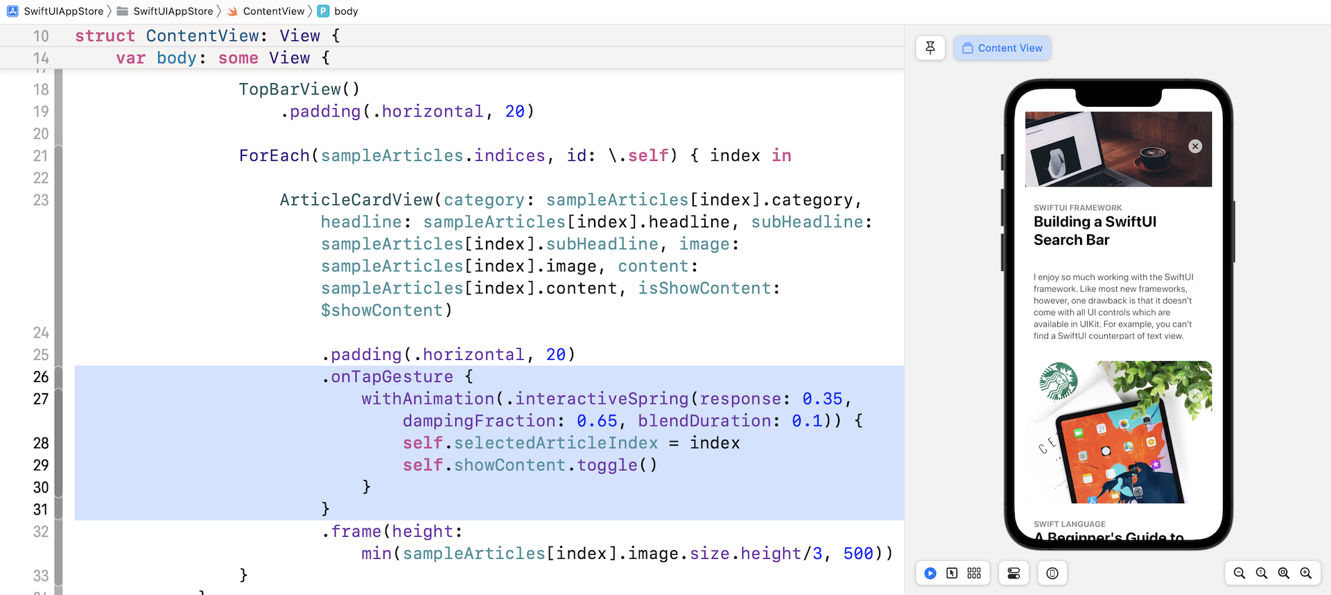
处理点击手势
当使用者点击其中一个卡片视图时,所选卡片将变为全屏幕模式。 要侦测点击手势,请在你刚刚添加的代码下方附加 .onTapGesture 修饰器(在.padding(.horizontal, 20)之下加入):
.onTapGesture {
    withAnimation(.interactiveSpring(response: 0.35, dampingFraction: 0.65, blendDuration: 0.1)) {
        self.selectedArticleIndex = index
        self.showContent.toggle()
    }
}
当检测到点击手势时,我们将showContent变量从false修改为true。 同时,我们保存所选卡片视图的索引。
让我们快速测试一下App!当你在预览画面中运行App时,点击任何卡片视图就可以测试到结果。 虽然它没有像预期般运作,但卡片视图应该显示文章的内容并隐藏子标题。 此外,你应该能点击关闭按钮以返回节录模式。 如果看不到内容,请向上拖动卡片视图以显示它。
利用 MatchedGeometryEffect 制作过场动画
我们如何将选定的卡片视图扩展为全屏幕卡片视图并为过渡设置动画? 在第 33 章中,我介绍了一个名为matchedGeometryEffect的修饰器。 使用这个强大的修饰符,你可以描述初始视图和最终视图的外观。 matchedGeometryEffect 然后计算这两个视图之间的差异并自动为大小和位置变化设置动画。
注意:如果你还没有阅读第 33 章,请先阅读本章。
在这个示例中,初始视图是摘录模式下的卡片视图,而最终视图是显示完整内容的卡片视图。 我们要做的是将当前滚动视图嵌入到一个 ZStack 视图中。 最初,App显示卡片视图列表。 当使用者点击任何卡片视图时,我们会将完整内容视图覆盖在现有滚动视图之上。
现在按住命令键并单击 ScrollView。 选择 Embed in ZStack。
将 ZStack 视图的 alignment 参数设置为 .top,如下所示:
ZStack(alignment: .top) {

  ScrollView {
    .
    .
    .
  }

}
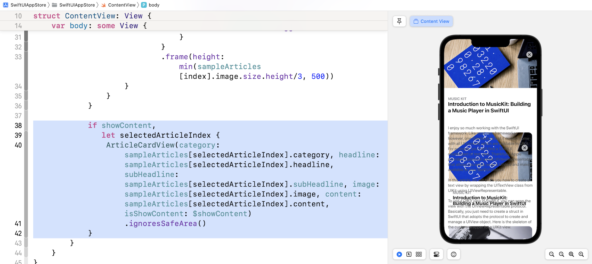
接下来,在滚动视图的右括号之后插入以下代码:
if showContent,
   let selectedArticleIndex {
    ArticleCardView(category: sampleArticles[selectedArticleIndex].category, headline: sampleArticles[selectedArticleIndex].headline, subHeadline: sampleArticles[selectedArticleIndex].subHeadline, image: sampleArticles[selectedArticleIndex].image, content: sampleArticles[selectedArticleIndex].content, isShowContent: $showContent)
        .ignoresSafeArea()
}
当使用者点击其中一个卡片视图时,showContent 的值将修改为 true,并且将 selectedArticleIndex 设置为所选卡片视图的索引。 在这种情况下,我们通过将 isShowContent 参数设置为 true 以完整内容模式显示卡片视图。
如果你在预览画布中测试App,点击卡片视图就会将其内容扩展到全屏幕。
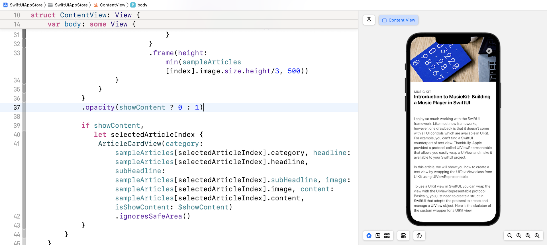
功能上是可以的,但效果看起来并不好。 完整内容卡片视图后面的列表仍然可见。 当选择任何卡片视图时,我们需要将其隐藏起来。 要解决此问题,请将 opacity 修饰器附加到 ScrollView:
.opacity(showContent ? 0 : 1)
当App显示卡片视图的全部内容时,我们将滚动视图的不透明度设置为 0。 再次测试App。 卡片视图应正确显示完整内容。
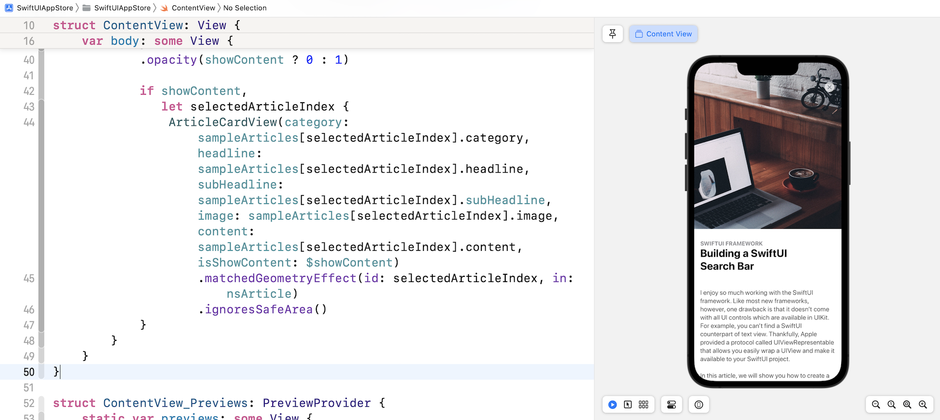
我们需要做的最后一件事是设置过场动画。 如本节初所述,我们可以利用 matchedGeometryEffect 修饰器让 SwiftUI 渲染过渡动画。
要使用修饰器,我们首先必须定义一个命名空间变量:
@Namespace var nsArticle
接下来,将 matchedGeometryEffect 修饰器附加到 ForEach 中的 ArticleCardView:
.matchedGeometryEffect(id: index, in: nsArticle)
You can place the line of code above before the onTapGesture modifier. For the ArticleCardView, attach another matchedGeometryEffect modifier and use the same namespace (insert it above the ignoresSafeArea modifier):
你可以将上面的代码行放在 onTapGesture 修饰器之前。 至于 ArticleCardView,附加另一个 matchedGeometryEffect 修饰器并使用相同的命名空间(将其加到 ignoresSafeArea 修饰器上方):
.matchedGeometryEffect(id: selectedArticleIndex, in: nsArticle)
通过上面的实现,SwiftUI 会自动计算视图转换动画。
放大图像
我们还未完成喔。 尽管我们解决了其中一个主要问题,但仍有一些问题在等待我们。 接下来是特色图片。 在完整内容模式下,我想让图像更大一点。 只需切换到 ArticleCardView.swift 并修改 Image 视图的 .frame 修饰器,如下所示:
.frame(width: geometry.size.width, height: self.isShowContent ? geometry.size.height * 0.7 : min(self.image.size.height/3, 500))
当卡片视图显示文章内容时,图像高度现在调整为屏幕高度的 70%。 你可以修改这个值以配合你的个人偏好。 现在回到 ContentView.swift 并测试修改, 特色图像在全内容模式下会变大。
总结
恭喜!你构建了一个类似于 App Store app 的动画。 在实现了这个示范 App 之后,我希望你了解如何创建复杂的视图动画,并了解如何使用 GeometryReader 来完善你的 UI。
动画已成为手机 App UI 的重要部分。 如你所见,SwiftUI 让开发人员可以非常轻松地构建一些漂亮的动画和视图过渡效果。 当你开发下一个App时,不要忘记应用在本章中所学到的技术,来提升使用者体验。
在本章所准备的示例档中,有最后完整的 Xcode 项目,可供你下载参考:
https://www.appcoda.com/resources/swiftui4/SwiftUIAppStore.zip