- Made by AppCoda
- Contact us / Support
- Tweet this book
- 序言
- 1. SwiftUI 介绍
- 2. SwiftUI 入门 - 文字的处理
- 3. 图片的处理
- 4. 以堆叠布局使用者介面
- 5. ScrollView 与 Carousel UI 的建立
- 6. SwiftUI 按钮与渐层
- 7. 状态(State)与绑定(Binding)
- 8. 实现路径(Path)与形状(Shape)来画线与圆饼图
- 9. 基础动画与转场
- 10. 动态列表、 ForEach 与 Identifiable 的使用方法
- 11. 导航UI与导航列客制化运用
- 12. 强制回应视图、浮动按钮与提示的实现
- 13. 以选取器(Picker)、开关(Toggle)与步进器(Stepper)来建立一个表单
- 14. 使用 Combine 与 Environment 物件进行数据分享
- 15. 以 Combine 与 视图模型建立一个注册表单
- 16. 滑动删除、内容菜单与动作列表
- 17. 认识手势(Gestures)
- 18. 以SwiftUI 手势与 GeometryReader 建立一个底部展开式页面
- 19. 使用手势与动画建立 Tinder 风格的 UI
- 20. 建立像 Apple Wallet App 的动画和转场效果
- 21. JSON、滑杆的运用与数据过滤
- 22. 如何使用 Core Data 建立 ToDo App
- 23. 利用 UIViewRepresentable 整合UIKit 组件
- 24. 建立搜寻栏视图并使用自订绑定(Custom Binding)
- 25. 把所学应用出来!构建个人理财App
- 26. 创建类似App Store使用的动画视图转换
- 27. 如何建立图像轮播(Image Carousel)
- 28. 如何建立展开式列表视图和大纲视图
- 29. 使用 LazyVGrid 和 LazyHGrid 构建集合视图
- 30. 使用 Shape 和 Animatable 开发带动画的环形进度条
- 31. 如何使用 AnimatableModifier 和 LibraryContentProvider
- 32. 使用 TextEditor 支持多行文字输入
- 33. 使用 matchedGeometryEffect为 App 建立绚丽的视图动画
- 34. ScrollViewReader 和网格动画
- 35. 标签视图的运用与自订标签列
- 36. 利用 AsyncImage 非同步加载和显示图像
- 37. 利用 Searchable 建立搜寻栏
- 38. 利用 Charts 框架建立图表
- 39. 利用 Live Text API 从图片中撷取文本
- 40. 通过 ShareLink 来分享文本和图像等数据
- 41. 利用 ImageRenderer API 轻松把 SwiftUI 视图转换为图像
- 42. 如何把 SwiftUI 视图转换为 PDF 文件
- 43. 使用 Gauge 视图显示进度并创建速度计
- 44. 使用Grid API 创建网格布局
- 45. 利用 AnyLayout 切换 UI 布局
- 46. 使用新的 NavigationStack 视图构建数据导向的导航
- 本书使用 GitBook 释出
第 43 章
使用 Gauge 视图显示进度并创建速度计
在 iOS 16,SwiftUI 引入了一个新视图 Gauge,用来显示进度。我们可以利用这个视图,来显示一定范围内的数值。在这篇教学文章中,让我们来看看如何使用 Gauge 视图,以及如何使用不同的 Gauge 样式。
Gauge 视图是用来显示当前数值在有限范围中的水平,就像是汽车中的油量表。开发者可以配置 Gauge 的显示,例如是 Gauge 当前的数值、范围、及描述其的用途的标签。
- Apple 官方文件
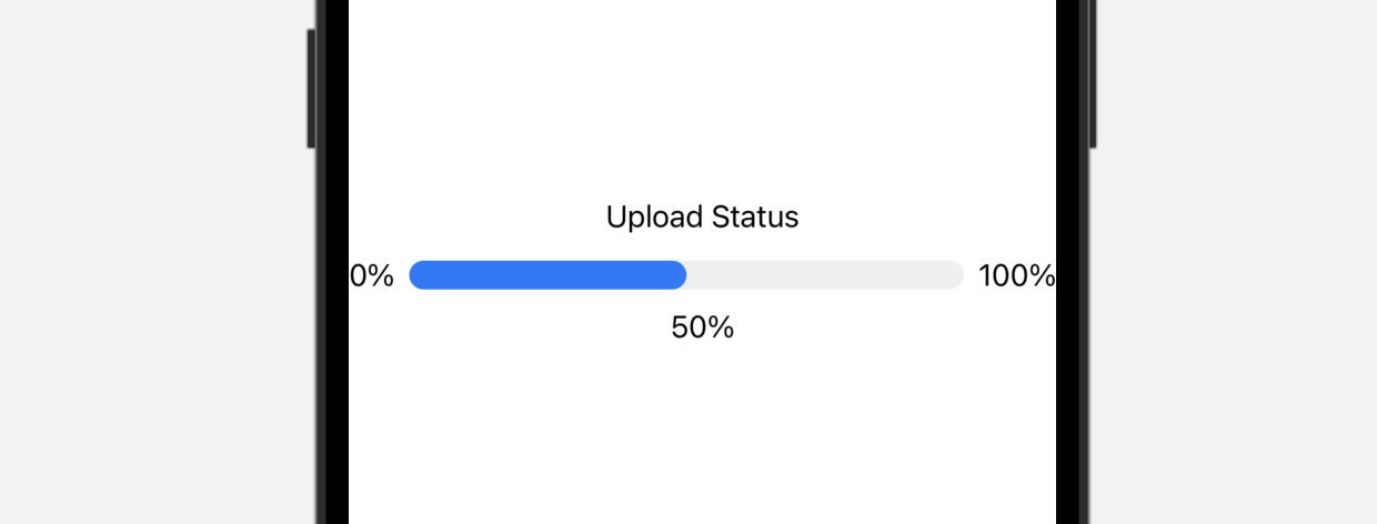
Gauge 最简单的使用方法是这样的:
struct ContentView: View {
    @State private var progress = 0.5

    var body: some View {
        Gauge(value: progress) {
            Text("Upload Status")
        }
    }
}
在最基本的形式中,Gauge 的默认范围是 0 到 1。如果我们将 value 参数设置为 0.5,SwiftUI 就会呈现一个进度条,指示任务已完成了 50%。
或者,我们也可以为 current value、minimum value 和 maximum value 设置标签:
Gauge(value: progress) {
    Text("Upload Status")
} currentValueLabel: {
    Text(progress.formatted(.percent))
} minimumValueLabel: {
    Text(0.formatted(.percent))
} maximumValueLabel: {
    Text(100.formatted(.percent))
}
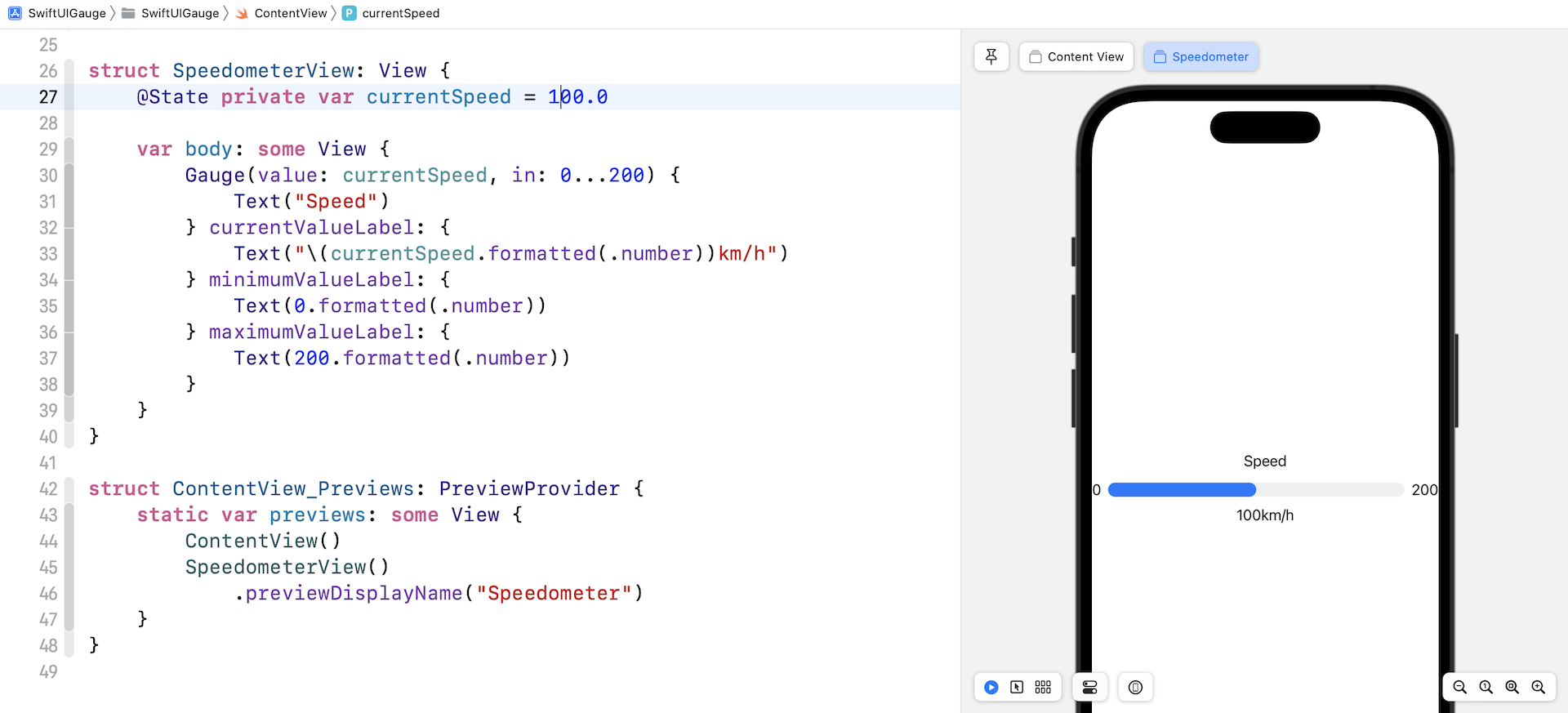
使用客制化范围
Gauge 的默认范围是 0 到 1,也就是说,我们可以客制化想要的范围。举个例子,我们正在构建一个速度计,其最高速率为 200 公里每小时。我们可以在 in 参数中指定范围:
struct SpeedometerView: View {
    @State private var currentSpeed = 100.0

    var body: some View {
        Gauge(value: currentSpeed, in: 0...200) {
            Text("Speed")
        } currentValueLabel: {
            Text("\(currentSpeed.formatted(.number))km/h")
        } minimumValueLabel: {
            Text(0.formatted(.number))
        } maximumValueLabel: {
            Text(200.formatted(.number))
        }
    }
}
在以上的代码中,我们设置范围为 0...200,也在预览结构中添加了 SpeedometerView。现在,如果我们把当前速度设置为 100 公里每小时,预览应该会填满进度条的一半。
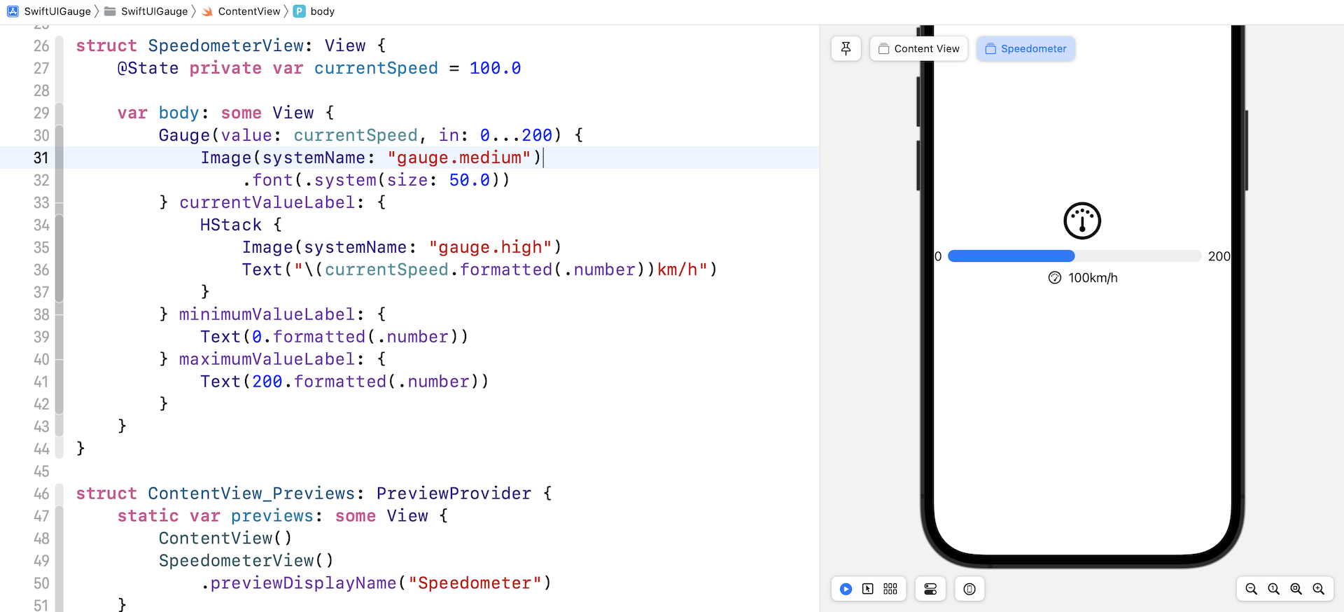
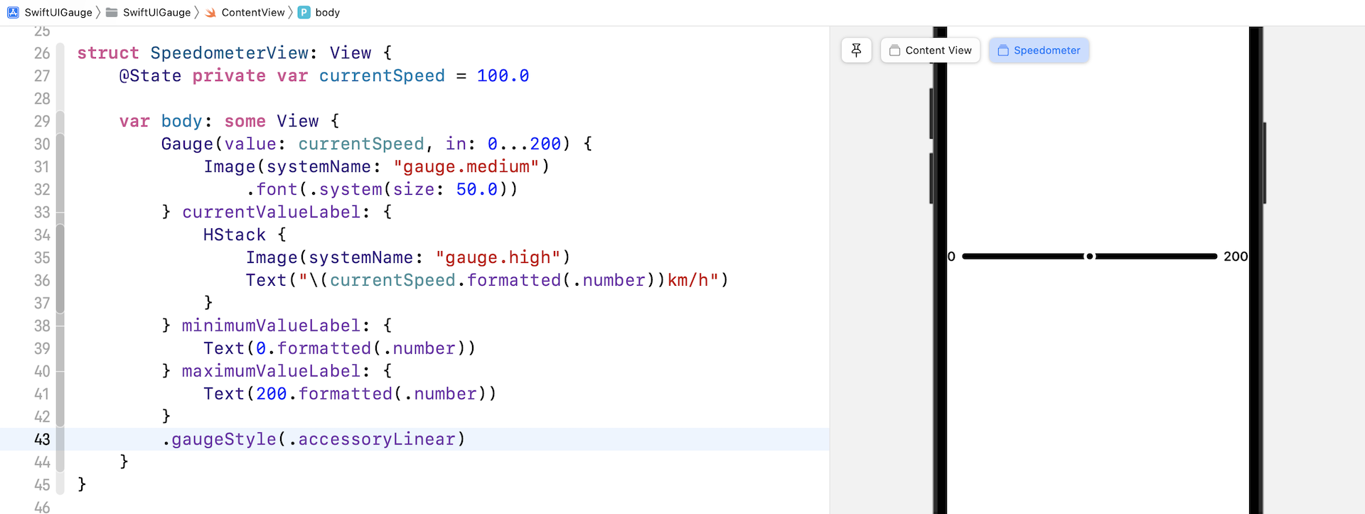
使用 Image Labels
我们也可以使用 text label 来显示范围和当前数值。让我们看看以下例子:
Gauge(value: currentSpeed, in: 0...200) {
    Image(systemName: "gauge.medium")
        .font(.system(size: 50.0))
} currentValueLabel: {
    HStack {
        Image(systemName: "gauge.high")
        Text("\(currentSpeed.formatted(.number))km/h")
    }
} minimumValueLabel: {
    Text(0.formatted(.number))
} maximumValueLabel: {
    Text(200.formatted(.number))
}
我们将 Gauge 的 text label 修改为系统图像,并为当前数值的 label 创建一个堆叠 (stack),来排列图像和文本。完成后,预览应该会是这样的:
客制化 Gauge 样式
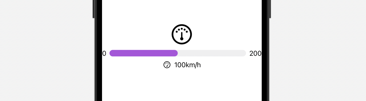
Gauge 视图默认的颜色是蓝色。要客制化 Gauge 视图的颜色,我们可以附加 tint 修饰符,并设置想要的颜色:
Gauge(value: currentSpeed, in: 0...200) {
    Image(systemName: "gauge.medium")
        .font(.system(size: 50.0))
} currentValueLabel: {
    HStack {
        Image(systemName: "gauge.high")
        Text("\(currentSpeed.formatted(.number))km/h")
    }
} minimumValueLabel: {
    Text(0.formatted(.number))
} maximumValueLabel: {
    Text(200.formatted(.number))
}
.tint(.purple)
Gauge 视图的外观与 ProgressView 非常相似。我们也可以使用 gaugeStyle 修饰符来客制化 Gauge 视图,这个修饰符支持多种内建样式。
linearCapacity
这是默认的样式,显示从左到右填满的进度条,就像上文的紫色进度条。
accessoryLinear
这个样式会显示一个进度条,当中有一个 point marker 指示当前数值。
accessoryLinearCapacity
这个样式的 Gauge 会显示一个比较幼的进度条。
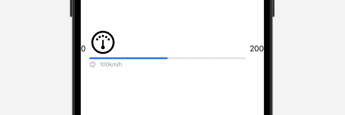
accessoryCircular
这个样式的 Gauge 不再是显示一个进度条,而是一个开口环形 (open ring),当中有一个 point marker 指示当前数值。
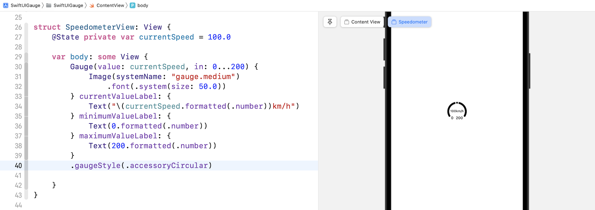
accessoryCircularCapacity
这个样式的 Gauge 会显示一个闭口环形 (closed ring),以填满的部分来反映当前数值,而当前数值也会在 Gauge 的中间显示出来。
建立一个客制化的 Gauge 样式
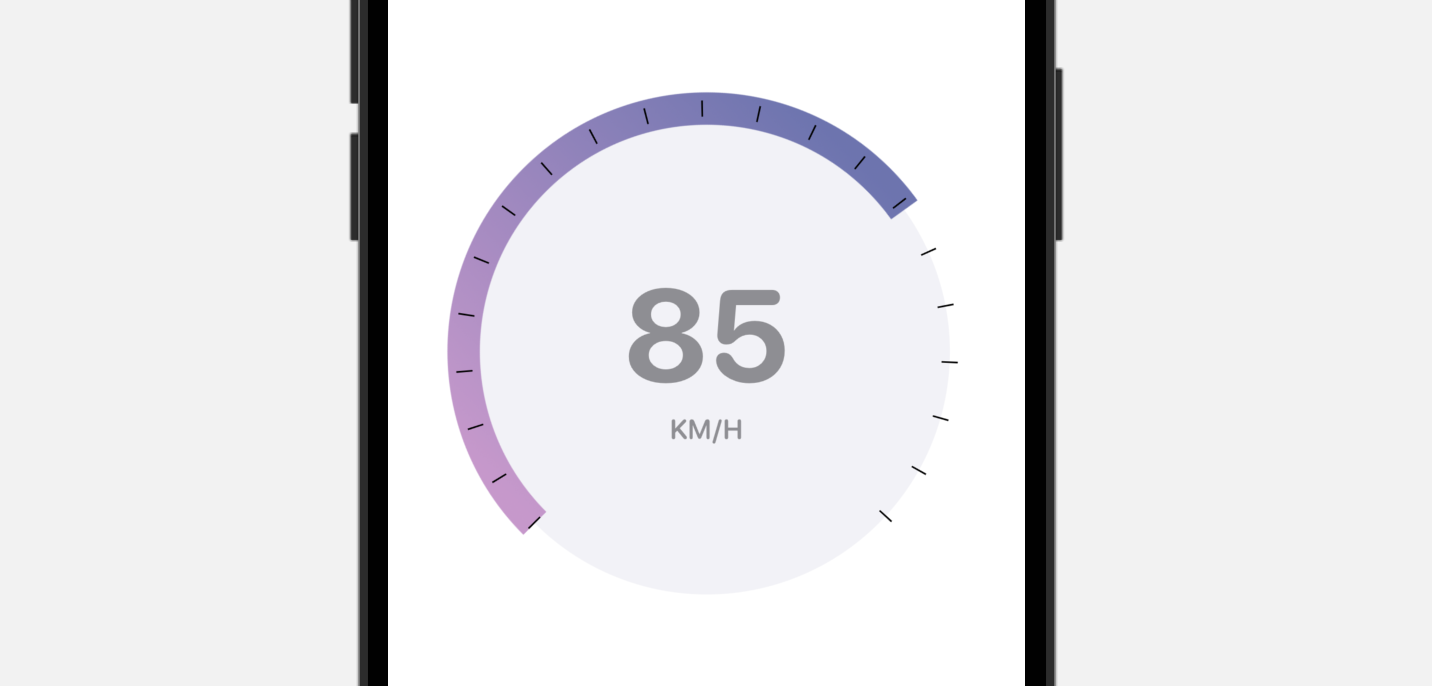
内建的 Gauge 样式有限,但是我们可以利用 SwiftUI 来建立自己的 Gauge 样式。让我们看看一个简单的示例,来建立上图的 Gauge 样式吧!
要建立一个客制化的 Gauge 样式,我们需要采用 GaugeStyle 协议,并编写自己的实现。以下是我们的客制化样式的实现:
struct SpeedometerGaugeStyle: GaugeStyle {
    private var purpleGradient = LinearGradient(gradient: Gradient(colors: [ Color(red: 207/255, green: 150/255, blue: 207/255), Color(red: 107/255, green: 116/255, blue: 179/255) ]), startPoint: .trailing, endPoint: .leading)

    func makeBody(configuration: Configuration) -> some View {
        ZStack {

            Circle()
                .foregroundColor(Color(.systemGray6))

            Circle()
                .trim(from: 0, to: 0.75 * configuration.value)
                .stroke(purpleGradient, lineWidth: 20)
                .rotationEffect(.degrees(135))

            Circle()
                .trim(from: 0, to: 0.75)
                .stroke(Color.black, style: StrokeStyle(lineWidth: 10, lineCap: .butt, lineJoin: .round, dash: [1, 34], dashPhase: 0.0))
                .rotationEffect(.degrees(135))

            VStack {
                configuration.currentValueLabel
                    .font(.system(size: 80, weight: .bold, design: .rounded))
                    .foregroundColor(.gray)
                Text("KM/H")
                    .font(.system(.body, design: .rounded))
                    .bold()
                    .foregroundColor(.gray)
            }

        }
        .frame(width: 300, height: 300)

    }

}
为了遵守 GaugeStyle 协议,我们需要实现 makeBody 方法,来显示我们自己的 Gauge 样式。configuration 捆绑了 Gauge 的当前数值和数值的 label。在上面的代码中,我们使用了这两个数值,来显示当前速率,并计算弧形的长度。
我们实现好客制化的 Gauge 样式后,就可以附加到 gaugeStyle 修饰器上来应用它。
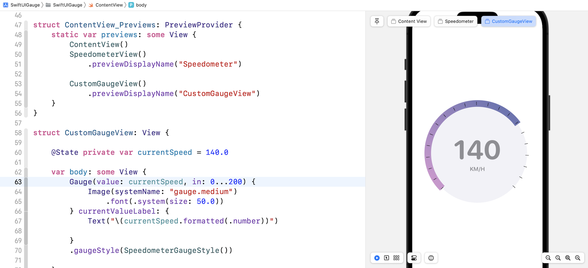
struct CustomGaugeView: View {

    @State private var currentSpeed = 140.0

    var body: some View {
        Gauge(value: currentSpeed, in: 0...200) {
            Image(systemName: "gauge.medium")
                .font(.system(size: 50.0))
        } currentValueLabel: {
            Text("\(currentSpeed.formatted(.number))")

        }
        .gaugeStyle(SpeedometerGaugeStyle())

    }
}
我另外为这个示例建立了一个视图。要预览 CustomGaugeView,我们需要修改 ContentView_Previews 结构,并添加 CustomGaugeView:
struct ContentView_Previews: PreviewProvider {
    static var previews: some View {
        ContentView()
        SpeedometerView()
            .previewDisplayName("Speedometer")

        CustomGaugeView()
            .previewDisplayName("CustomGaugeView")
    }
}
就是这样!修改好之后,预览就会显示客制化的 Gauge。
总结
在本章中,你学习了如何使用新的Gauge视图构建速度计。 除了速度计,你还可以使用 Gauge 来显示进度或任何其他测量值。 Gauge 视图是可灵活运用的。 你只需要采用 GaugeStyle 协议就可以创建自己的 Gauge 样式。
在本章所准备的示例档中,有最后完整的 Xcode 项目,可供你下载参考: