- Made by AppCoda
- Contact us / Support
- Tweet this book
- 序言
- 1. SwiftUI 介绍
- 2. SwiftUI 入门 - 文字的处理
- 3. 图片的处理
- 4. 以堆叠布局使用者介面
- 5. ScrollView 与 Carousel UI 的建立
- 6. SwiftUI 按钮与渐层
- 7. 状态(State)与绑定(Binding)
- 8. 实现路径(Path)与形状(Shape)来画线与圆饼图
- 9. 基础动画与转场
- 10. 动态列表、 ForEach 与 Identifiable 的使用方法
- 11. 导航UI与导航列客制化运用
- 12. 强制回应视图、浮动按钮与提示的实现
- 13. 以选取器(Picker)、开关(Toggle)与步进器(Stepper)来建立一个表单
- 14. 使用 Combine 与 Environment 物件进行数据分享
- 15. 以 Combine 与 视图模型建立一个注册表单
- 16. 滑动删除、内容菜单与动作列表
- 17. 认识手势(Gestures)
- 18. 以SwiftUI 手势与 GeometryReader 建立一个底部展开式页面
- 19. 使用手势与动画建立 Tinder 风格的 UI
- 20. 建立像 Apple Wallet App 的动画和转场效果
- 21. JSON、滑杆的运用与数据过滤
- 22. 如何使用 Core Data 建立 ToDo App
- 23. 利用 UIViewRepresentable 整合UIKit 组件
- 24. 建立搜寻栏视图并使用自订绑定(Custom Binding)
- 25. 把所学应用出来!构建个人理财App
- 26. 创建类似App Store使用的动画视图转换
- 27. 如何建立图像轮播(Image Carousel)
- 28. 如何建立展开式列表视图和大纲视图
- 29. 使用 LazyVGrid 和 LazyHGrid 构建集合视图
- 30. 使用 Shape 和 Animatable 开发带动画的环形进度条
- 31. 如何使用 AnimatableModifier 和 LibraryContentProvider
- 32. 使用 TextEditor 支持多行文字输入
- 33. 使用 matchedGeometryEffect为 App 建立绚丽的视图动画
- 34. ScrollViewReader 和网格动画
- 35. 标签视图的运用与自订标签列
- 36. 利用 AsyncImage 非同步加载和显示图像
- 37. 利用 Searchable 建立搜寻栏
- 38. 利用 Charts 框架建立图表
- 39. 利用 Live Text API 从图片中撷取文本
- 40. 通过 ShareLink 来分享文本和图像等数据
- 41. 利用 ImageRenderer API 轻松把 SwiftUI 视图转换为图像
- 42. 如何把 SwiftUI 视图转换为 PDF 文件
- 43. 使用 Gauge 视图显示进度并创建速度计
- 44. 使用Grid API 创建网格布局
- 45. 利用 AnyLayout 切换 UI 布局
- 46. 使用新的 NavigationStack 视图构建数据导向的导航
- 本书使用 GitBook 释出
第 38 章
利用 Charts 框架建立图表
在 iOS 16 的新版 SwiftUI 中,我最喜欢的其中一个功能就是 Charts 框架。在 iOS 16 之前,我们需要构建自己的图表、或是依靠第三方程序库来建立图表。Apple 推出了这个新框架,开发者就可以更轻松地创建动画化和互动的图表。
建立简单的长条图
简单来说,我们只需要定义 Mark,就可以构建出 SwiftUI 图表。让我们看看这个简单的例子:
import SwiftUI
import Charts
struct ContentView: View {
var body: some View {
Chart {
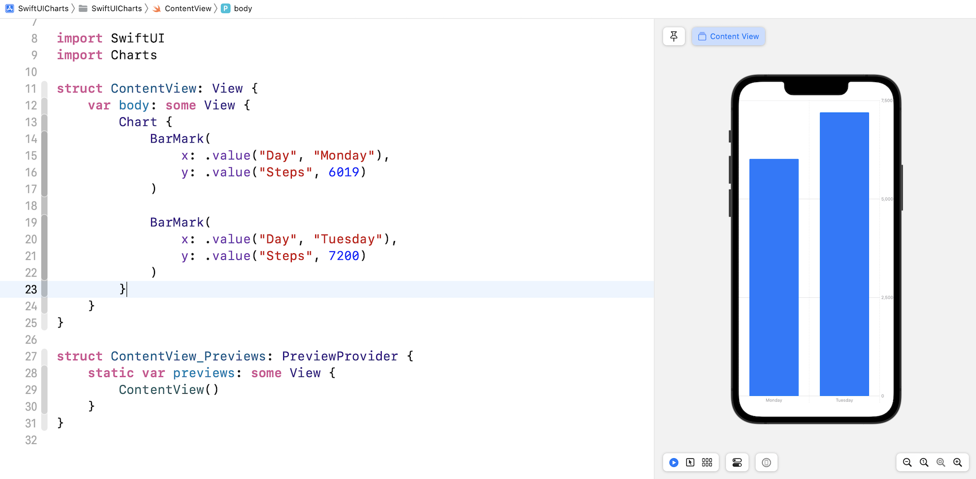
BarMark(
x: .value("Day", "Monday"),
y: .value("Steps", 6019)
)
BarMark(
x: .value("Day", "Tuesday"),
y: .value("Steps", 7200)
)
}
}
}
无论我们想要构建长条图还是折线图,我们都会从 Chart 视图开始。在图表里面,我们可以定义 bar mark,来提供图表数据。BarMark 视图是用来构建长条图的,每一个 BarMark 视图都会有 x 和 y 值,x 值就是代表 x 轴的图表数据,如此类推。在以上的代码中,我把 x 轴的标签设置为 Day,而 y 轴就是总步数。
让我们在 Xcode 14 输入以上代码,预览就会自动显示有两个垂直长方体的长条图。
以上就是创建长条图最简单的方法。不过,我们通常都不会对图表数据进行硬编码 (hardcode),而是在 Charts API 编写一组数据。让我们看看以下例子:
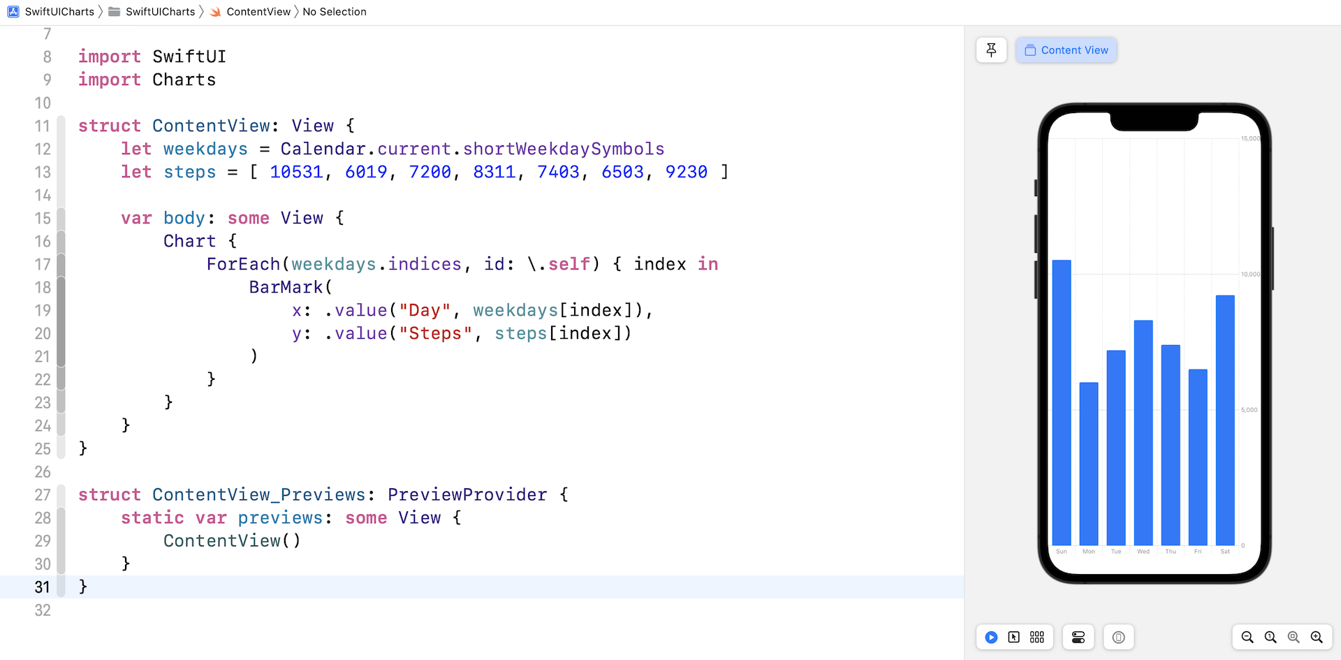
struct ContentView: View {
    let weekdays = Calendar.current.shortWeekdaySymbols
    let steps = [ 10531, 6019, 7200, 8311, 7403, 6503, 9230 ]

    var body: some View {
        Chart {
            ForEach(weekdays.indices, id: \.self) { index in
                BarMark(x: .value("Day", weekdays[index]), y: .value("Steps", steps[index]))
            }
        }
    }
}
我们为图表数据创建了两个数组(weekdays和steps)。 在 Chart 视图中,我们读取 weekdays 数组并显示图表数据。 如果你已在 Xcode 项目中输入代码,预览部分应该呈现如图 38.2 所示的条形图。
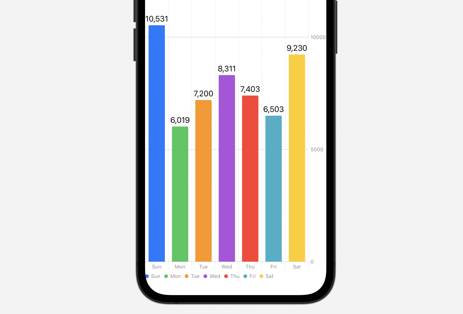
在默认情况下,Charts API 会以相同颜色呈现所有长方体。如果我们想把每个长方体设置为不同的颜色,可以将 foregroundStyle 修饰符附加到 BarMark 视图:
.foregroundStyle(by: .value("Day", weekdays[index]))
如果我们想为所有长方体添加注释,可以使用 annotation 修饰器:
.annotation {
    Text("\(steps[index])")
}
作出这些改动后,长条图就更加漂亮了。
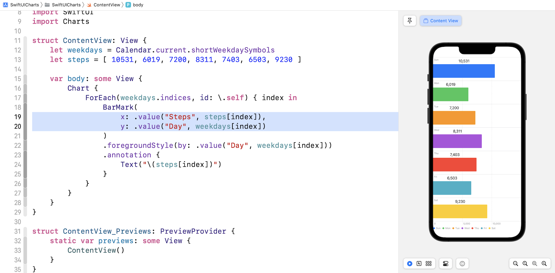
如果想要建立横向的长条图,我们只需要把 BarMark 视图内的 x 和 y 参数 (parameter) 交换就可以了。
建立折线图
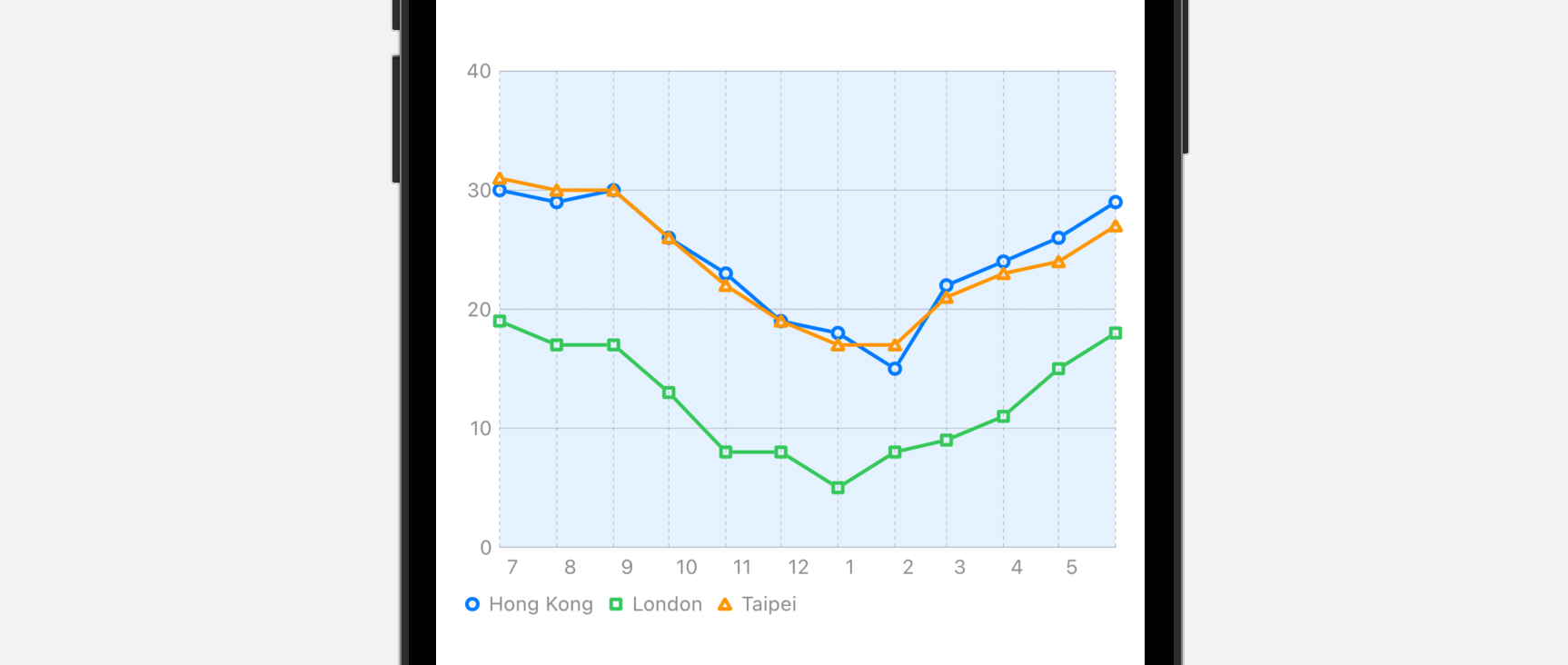
你已学会如何建立长条图,现在我们会示范使用 SwiftUI Charts API,来构建一个折线图,显示 2021 年 7 月至 2022 年 6 月香港、台北和伦敦的平均气温。
让我们先建立一个 WeatherData 结构,来储存天气数据。在你的 Xcode 项目中,使用 Swift File 模板创建一个名为 WeatherData 的新文件。 在文件中加入以下代码:
struct WeatherData: Identifiable {
    let id = UUID()
    let date: Date
    let temperature: Double

    init(year: Int, month: Int, day: Int, temperature: Double) {
        self.date = Calendar.current.date(from: .init(year: year, month: month, day: day)) ?? Date()
        self.temperature = temperature
    }
}

let hkWeatherData = [
  WeatherData(year: 2021, month: 7, day: 1, temperature: 30.0),
  WeatherData(year: 2021, month: 8, day: 1, temperature: 29.0),
  WeatherData(year: 2021, month: 9, day: 1, temperature: 30.0),
  WeatherData(year: 2021, month: 10, day: 1, temperature: 26.0),
  WeatherData(year: 2021, month: 11, day: 1, temperature: 23.0),
  WeatherData(year: 2021, month: 12, day: 1, temperature: 19.0),
  WeatherData(year: 2022, month: 1, day: 1, temperature: 18.0),
  WeatherData(year: 2022, month: 2, day: 1, temperature: 15.0),
  WeatherData(year: 2022, month: 3, day: 1, temperature: 22.0),
  WeatherData(year: 2022, month: 4, day: 1, temperature: 24.0),
  WeatherData(year: 2022, month: 5, day: 1, temperature: 26.0),
  WeatherData(year: 2022, month: 6, day: 1, temperature: 29.0)
]

let londonWeatherData = [
  WeatherData(year: 2021, month: 7, day: 1, temperature: 19.0),
  WeatherData(year: 2021, month: 8, day: 1, temperature: 17.0),
  WeatherData(year: 2021, month: 9, day: 1, temperature: 17.0),
  WeatherData(year: 2021, month: 10, day: 1, temperature: 13.0),
  WeatherData(year: 2021, month: 11, day: 1, temperature: 8.0),
  WeatherData(year: 2021, month: 12, day: 1, temperature: 8.0),
  WeatherData(year: 2022, month: 1, day: 1, temperature: 5.0),
  WeatherData(year: 2022, month: 2, day: 1, temperature: 8.0),
  WeatherData(year: 2022, month: 3, day: 1, temperature: 9.0),
  WeatherData(year: 2022, month: 4, day: 1, temperature: 11.0),
  WeatherData(year: 2022, month: 5, day: 1, temperature: 15.0),
  WeatherData(year: 2022, month: 6, day: 1, temperature: 18.0)
]

let taipeiWeatherData = [
  WeatherData(year: 2021, month: 7, day: 1, temperature: 31.0),
  WeatherData(year: 2021, month: 8, day: 1, temperature: 30.0),
  WeatherData(year: 2021, month: 9, day: 1, temperature: 30.0),
  WeatherData(year: 2021, month: 10, day: 1, temperature: 26.0),
  WeatherData(year: 2021, month: 11, day: 1, temperature: 22.0),
  WeatherData(year: 2021, month: 12, day: 1, temperature: 19.0),
  WeatherData(year: 2022, month: 1, day: 1, temperature: 17.0),
  WeatherData(year: 2022, month: 2, day: 1, temperature: 17.0),
  WeatherData(year: 2022, month: 3, day: 1, temperature: 21.0),
  WeatherData(year: 2022, month: 4, day: 1, temperature: 23.0),
  WeatherData(year: 2022, month: 5, day: 1, temperature: 24.0),
  WeatherData(year: 2022, month: 6, day: 1, temperature: 27.0)
]
因为 Chart initializer 接受 Identifiable 物件的列表,所以我们要让 WeatherData 遵守 Identifiable 协议。我们要为每个城市创建一个数组 (array),来储存天气数据。
在项目导航器中,使用 SwiftUI View 模板创建一个名为 SimpleLineChartView 的新文件。不论我们要利用 Charts 框架建立什么图表,都需要先汇入 Charts 框架:
import Charts
然后,我们声明一个数组去储存三个城市的天气数据:
let chartData = [ (city: "Hong Kong", data: hkWeatherData),
                  (city: "London", data: londonWeatherData),
                  (city: "Taipei", data: taipeiWeatherData) ]
在body变量中,像这样修改代码以创建折线图:
VStack {
    Chart {
        ForEach(hkWeatherData) { item in
            LineMark(
                x: .value("Month", item.date),
                y: .value("Temp", item.temperature)
            )
        }
    }
    .frame(height: 300)
}
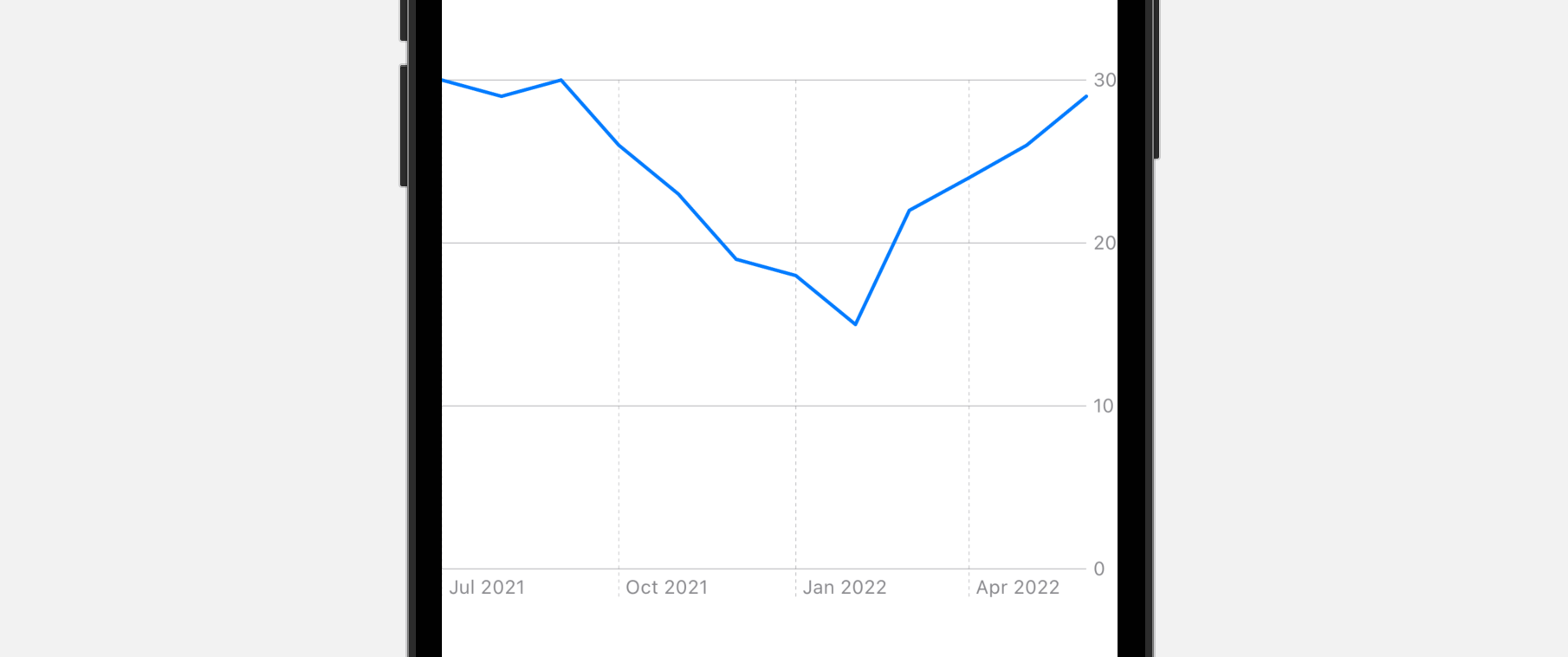
以上的代码绘制了一个折线图,来显示香港的平均气温。ForEach 语句 loop through 储存在 hkWeatherData 中的所有项目。我们会为每个项目创建一个 LineMark 物件,当中 x 轴设置为日期,而 y 轴则设置为平均气温。
我们也可以选择使用 frame 修饰符,来调整图表的大小。如果我们在 Xcode 预览中预览代码,应该会看到如图 38.5 的折线图:
客制化图表轴
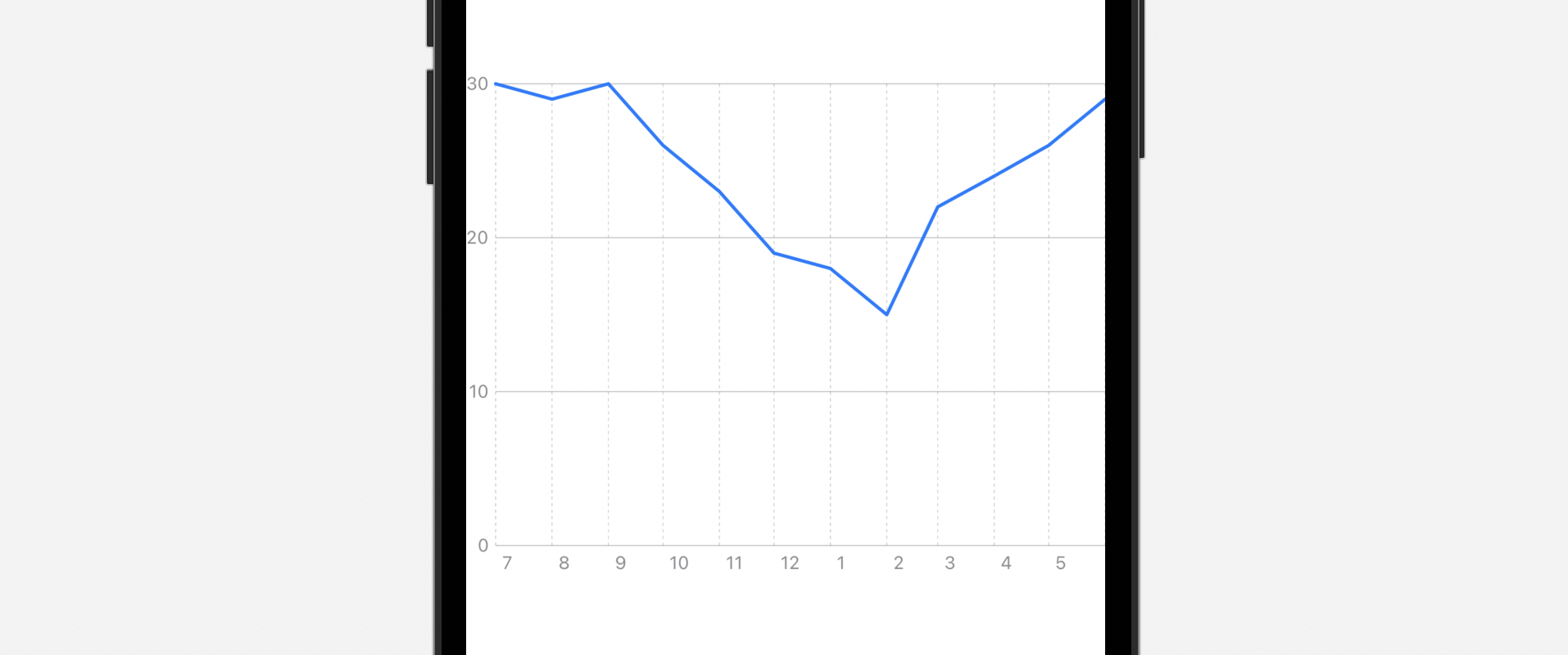
我们可以利用 chartXAxis 和 chartYAxis 修饰符,来客制化 x 和 y 轴。比如说,如果我们想以数字格式显示月份,我们可以将 chartXAxis 修饰符附加到 Chart视图:
.chartXAxis {
    AxisMarks(values: .stride(by: .month)) { value in
        AxisGridLine()
        AxisValueLabel(format: .dateTime.month(.defaultDigits))
    }
}
在 chartXAxis 中,我们为月份的数值创建了一个 AxisMarks 的视觉标记 (visual mark)。针对每个数值,我们可以使用特定格式显示一个 ValueLabel。以下这行代码就告诉了 SwiftUI 图表,我们想要使用数字格式显示月份:
.dateTime.month(.defaultDigits)
另外,我们也使用了 AxisGridLine 来添加一些 grid line。
至于 y 轴,我们之前是在后面(右侧)显示 y 轴的,我们想改为在前面(左侧)显示。让我们如此附加 chartYAxis 修饰符:
.chartYAxis {
    AxisMarks(position: .leading)
}
做好改动之后,Xcode 预览应该会把图表修改如下。y 轴会在左侧显示,而月份的格式也会变成以数字格式显示。另外,你也应该会看到 grid line。
客制化绘图区域的背景颜色
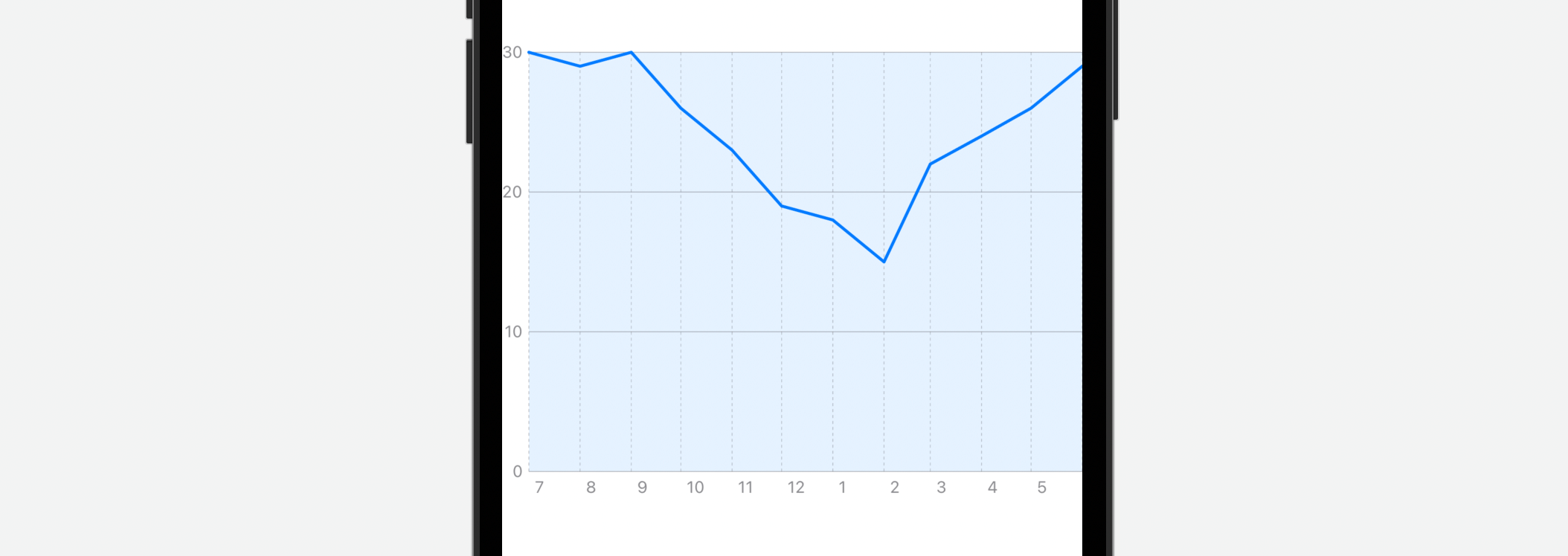
我们可以利用 chartPlotStyle 修饰器,来修改绘图区域的背景颜色。让我们将修饰符附加到 Chart 视图:
.chartPlotStyle { plotArea in
    plotArea
        .background(.blue.opacity(0.1))
}
然后,我们就可以使用 background 修饰符修改绘图区域的颜色。在上面的例子中,我们把绘图区域修改成浅蓝色。
构建多于一条线的折线图
现在,图表只显示单一数据(香港的天气数据),那我们如何把伦敦和台北的天气数据显示在同一个折线图中呢?
我们可以这样重写 Chart 视图的代码:
Chart {
    ForEach(chartData, id: \.city) { series in
        ForEach(series.data) { item in
            LineMark(
                x: .value("Month", item.date),
                y: .value("Temp", item.temperature)
            )
        }
        .foregroundStyle(by: .value("City", series.city))
    }
}
我们有另一个 ForEach 来读取三个城市的数据。我们在这里使用了 foregroundStyle 修饰符,为每条线应用不同的颜色。我们不需要指定颜色,SwiftUI 会自动选择颜色。
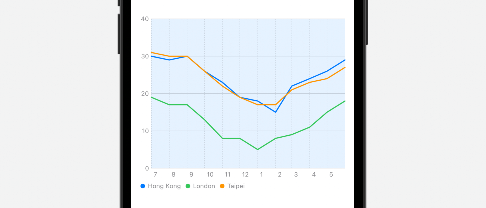
现在,三个城市的符号都相同。如果要使用不同的符号,让我们在 foregroundStyle 之后添加这行代码:
.symbol(by: .value("City", series.city))
如此一来,不同城市就会有不同的符号了。
客制化内插 (Interpolation) 方法
我们可以把 interpolationMethod 修饰器附加到 LineMark,来修改折线图的内插方法。
.interpolationMethod(.stepStart)
如果我们把内插方法设置为 .stepStart,折线图就会变成这样:
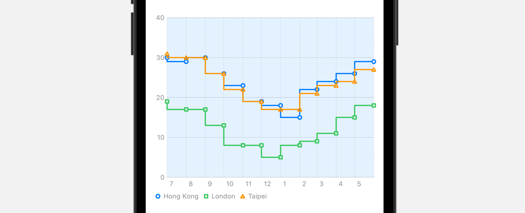
除了 .stepStart 之外,我们还可以使用以下设定:
- cardinal
- catmullRom
- linear
- monotone
- stepCenter
- stepEnd
总结
Charts 框架是 SwiftUI 一个很好的新功能,即使是 SwiftUI 的初学者,用几行代码,就可以构建出漂亮的图表。虽然这篇教学文章以折线图为例子,但其实我们可以利用 Charts API 轻松地将折线图转换为其他图表,例如长条图。你可以参阅 Swift Charts 文档深入了解这个 API。
在本章所准备的示例档中,有最后完整的 Xcode 项目,可供你下载参考: